

The good news is that this isn't about following rigid rules. It's about understanding why certain combinations work and others don't – and then applying that logic to what you already have or what you're planning to buy.
Why Mixing Wood Tones Works (When It's Done Right)
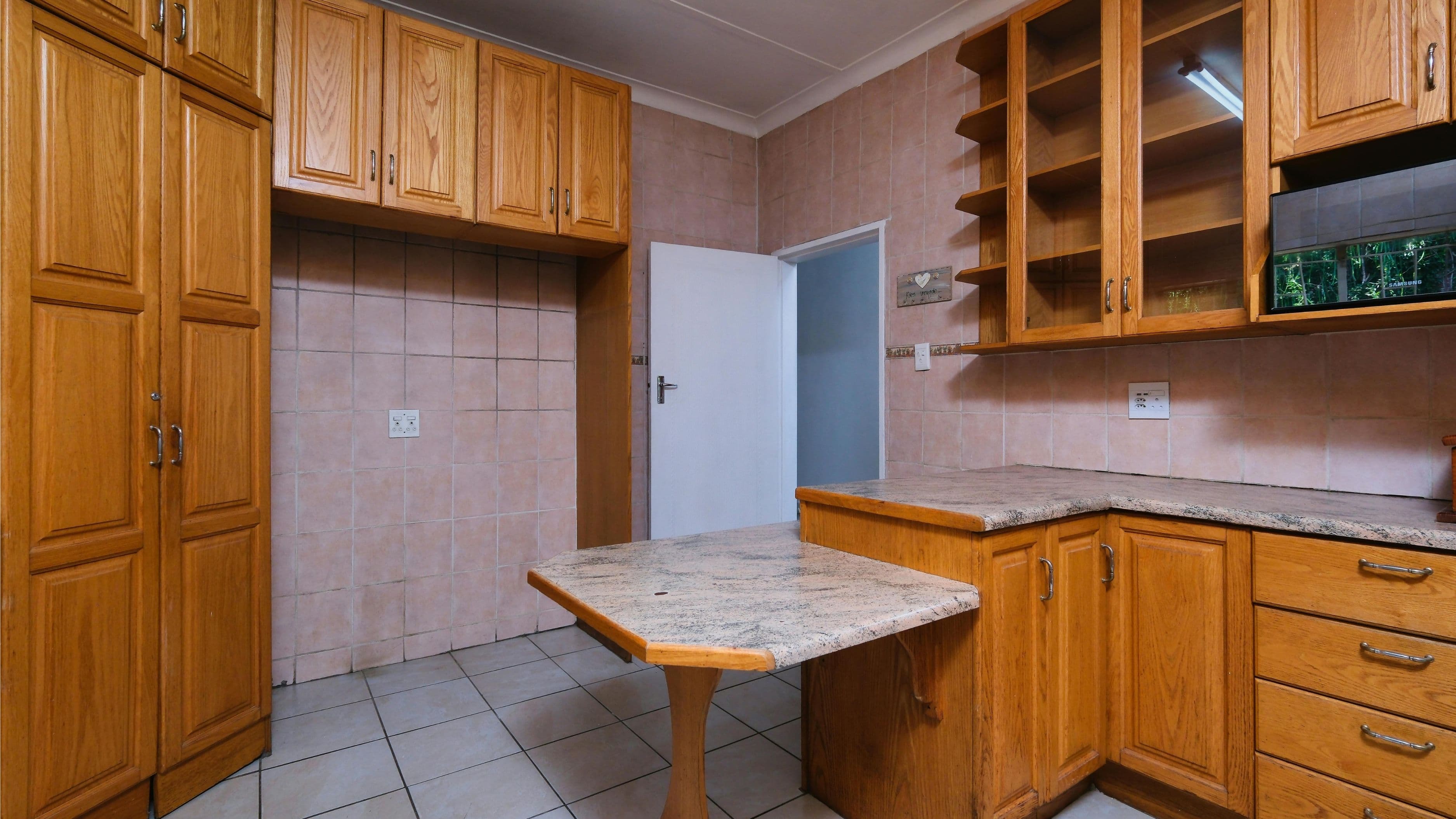
Single-tone rooms can feel flat and overly coordinated in a way that reads as staged rather than lived-in. Wood tones that are all exactly the same also highlight any slight variation in finish or aging, making the overall effect look cheaper than rooms that deliberately mix. A thoughtful mix of wood tones, on the other hand, creates visual depth and warmth that a perfectly matched room rarely achieves.
The key word is "thoughtful." The rooms that look curated rather than cluttered are working with a clear logic – typically a dominant tone, a secondary tone that complements it, and intentional contrast rather than accidental variety. When you can see the decision-making behind the choices, the room reads as designed. When you can't, it reads as random.
Step 1: Identify Your Dominant Wood Tone
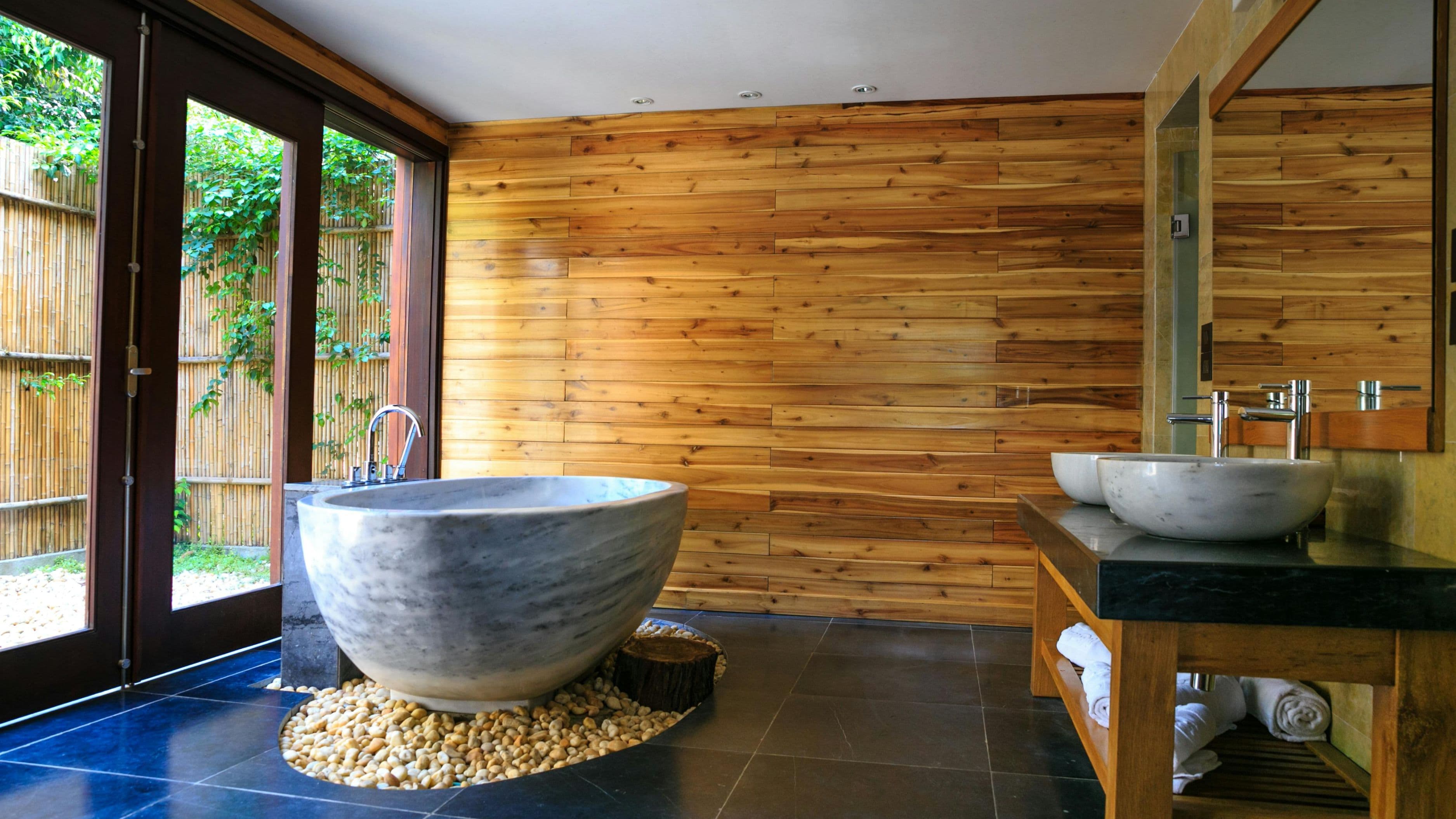
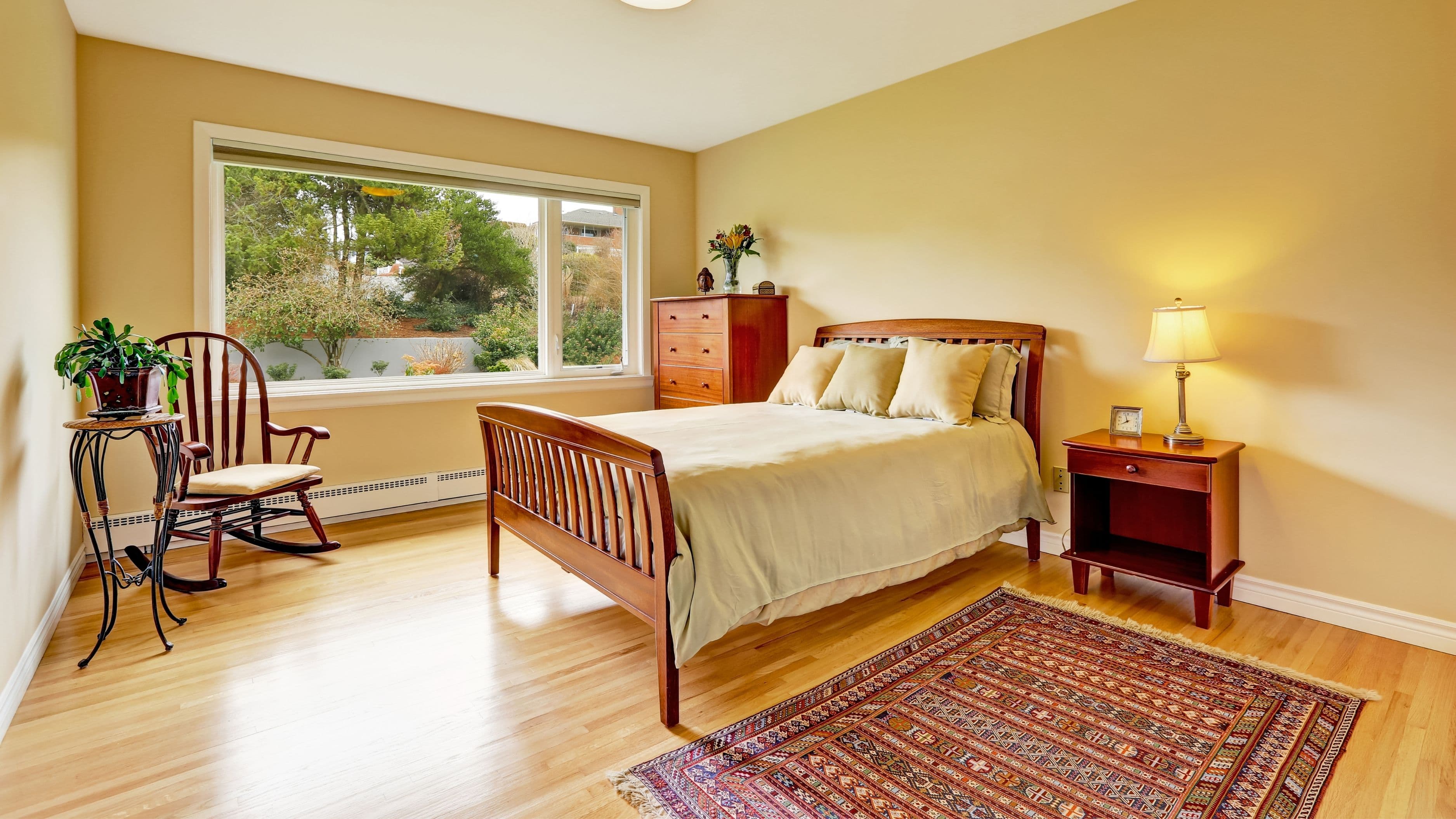
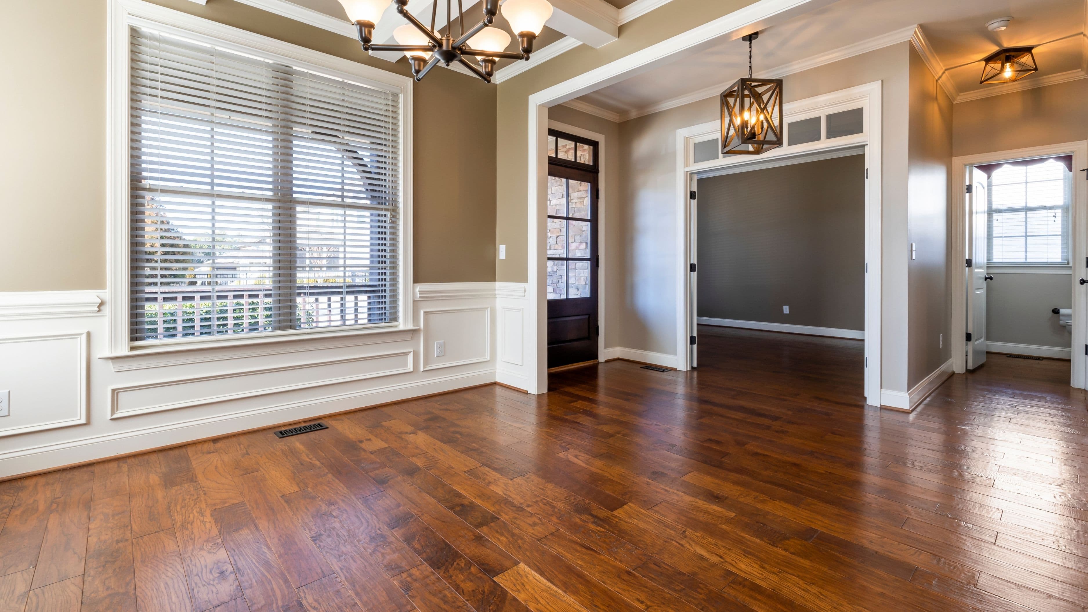
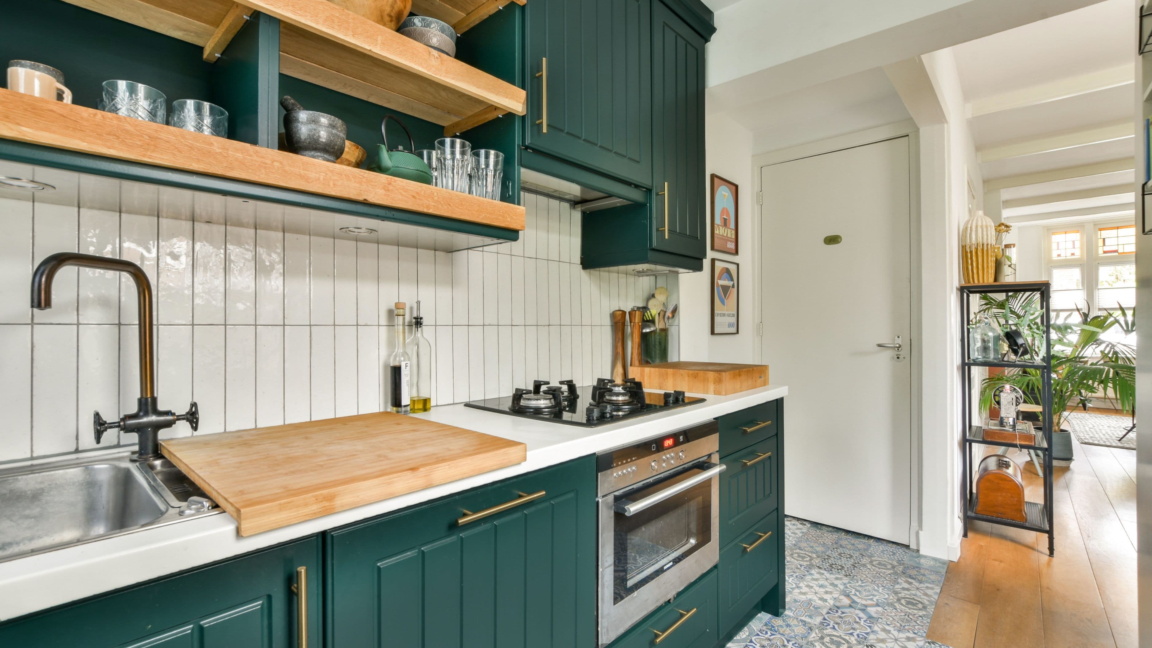
Every room with mixed wood tones needs an anchor – one tone that takes up the most visual space and sets the palette for everything else. This is usually your largest piece: the flooring, a built-in bookcase, the dining table, or the kitchen cabinetry. Whatever occupies the most square footage or commands the most visual attention is your dominant tone.
Before adding anything else, get clear on what that tone actually is. Is it a warm golden oak? A cool ashy grey? A rich amber walnut? A pale Scandinavian birch? Taking a photo of it in natural light helps, because wood tones often look different under artificial lighting than they do in daylight, and that difference matters when you're choosing what to pair with it.
Once you've identified the dominant tone, every other wood choice in the room should either complement it or contrast it deliberately – not accidentally fall somewhere in between.
Step 2: Understand the Warm-to-Cool Spectrum
Wood tones sit on a spectrum from warm (golden, amber, reddish, honey) to cool (grey, ash, whitewashed, silvery). The most common mixing mistake is combining tones from the same temperature zone that are slightly different from each other – a warm golden oak paired with a slightly different warm pine, for example. The result looks like someone tried to match and failed, rather than a deliberate design choice. It's the worst of both worlds: not matched, not contrasted.
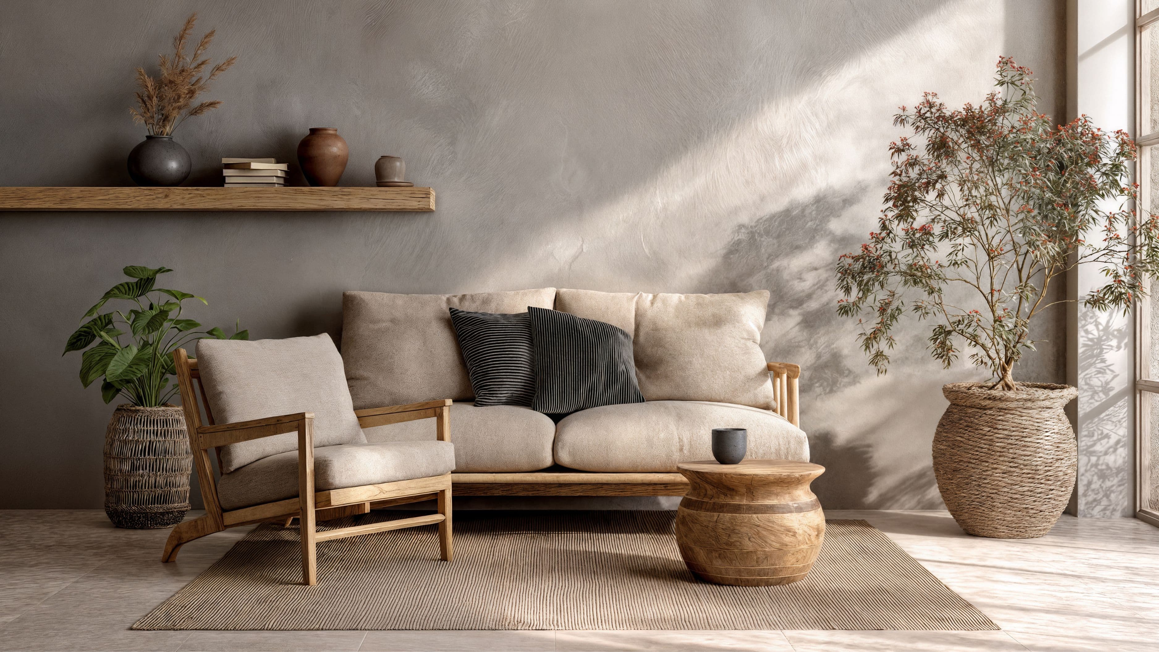
The safer mixing strategy is to either stay within the warm family and create variation through tone depth (light and dark warm tones together), or to pair warm and cool in a way that creates clear contrast. A warm honey oak floor pairs beautifully with a cool grey-washed side table because the contrast is obvious and intentional. The same floor paired with a slightly orange pine nightstand looks like a mistake.
If you're not sure whether two pieces are clashing or working together, squint at them. If the difference is subtle and slightly uncomfortable, that's usually a sign the tones are too close without being matched. If the contrast reads as deliberate, you're in good shape.
Step 3: Use the 60-30-10 Logic for Wood Tones
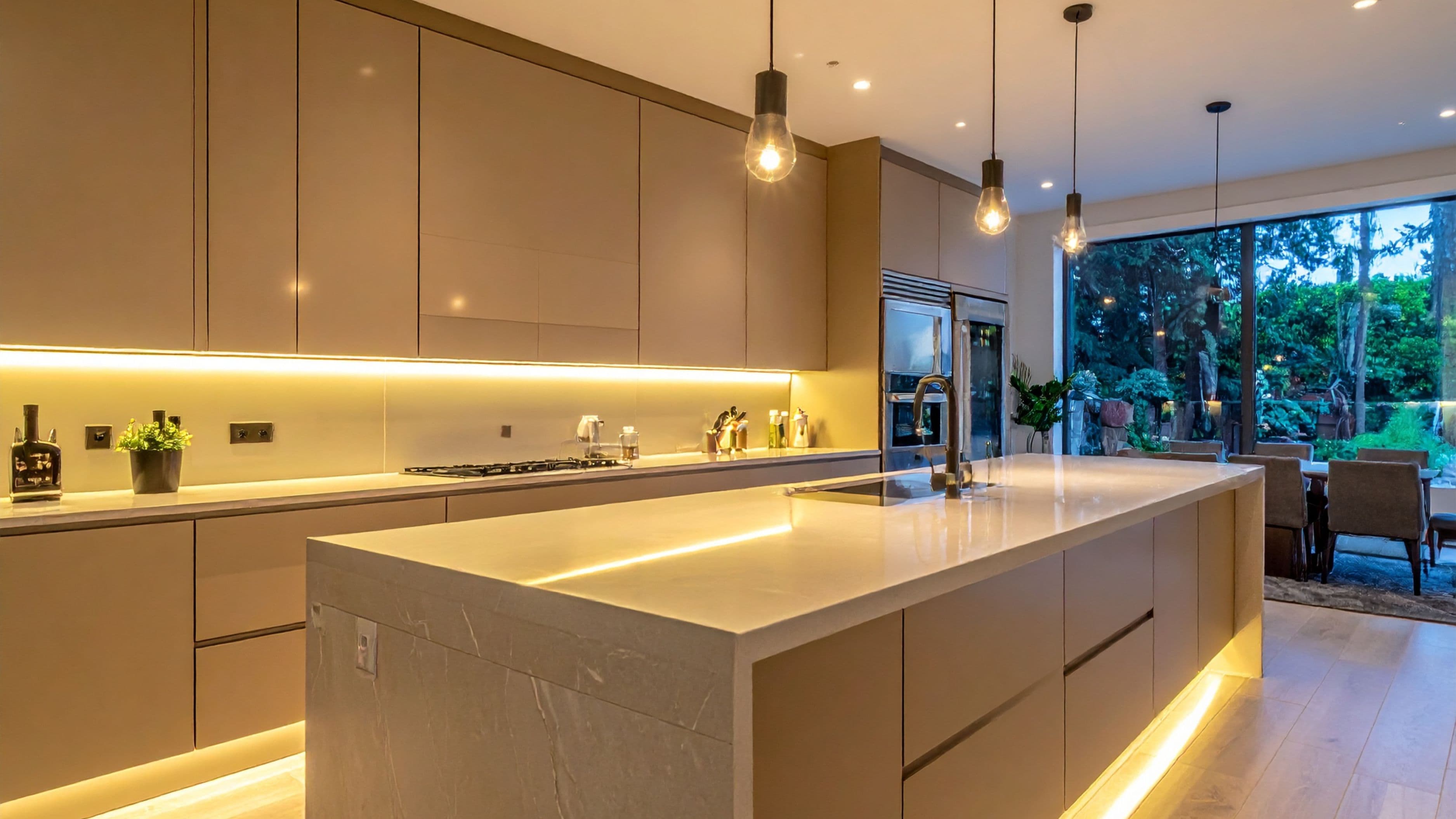
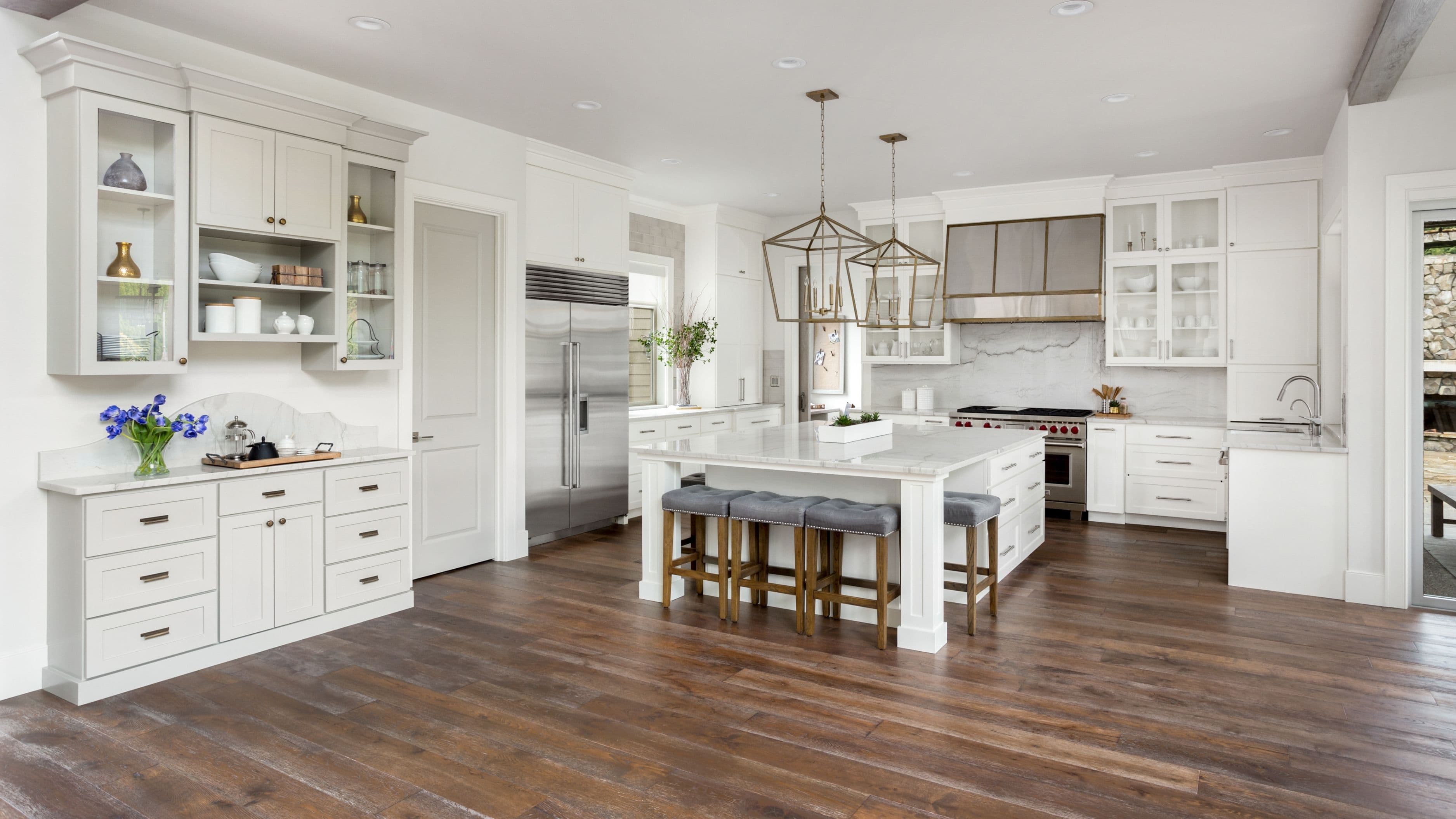
The classic interior design proportion rule – 60% dominant, 30% secondary, 10% accent – translates well to wood tone distribution. Your dominant tone (the floor, the main cabinetry, the largest furniture piece) covers the most space. Your secondary tone (a coffee table, a bed frame, shelving) reinforces the palette without replicating it exactly. Your accent tone (a decorative tray, a stool, a small accent table) introduces contrast or variation at a small enough scale that it grounds the room without competing for attention.
In a living room, this might look like: light oak engineered hardwood floor as the dominant tone, a medium walnut TV console as the secondary, and a small ebonized wood side table as the accent. In a bedroom, it might be: whitewashed wide-plank floors, a mid-toned teak bed frame, and a darker nightstand. The ratio matters because it prevents the eye from bouncing between equally weighted competing tones, which is what creates the cluttered feeling in mixed-wood rooms that don't work.
Step 4: Use Grain Pattern as a Mixing Tool
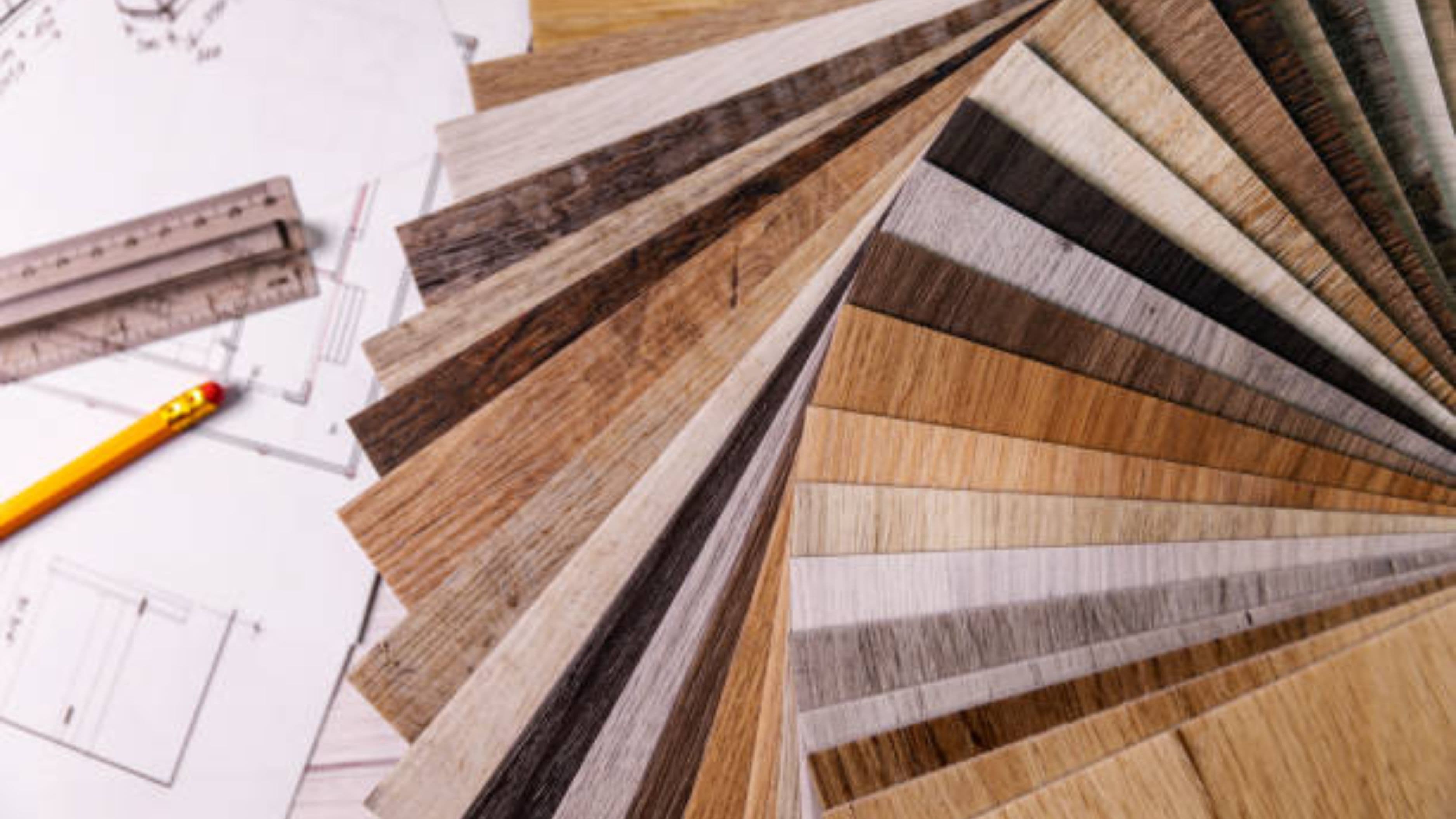
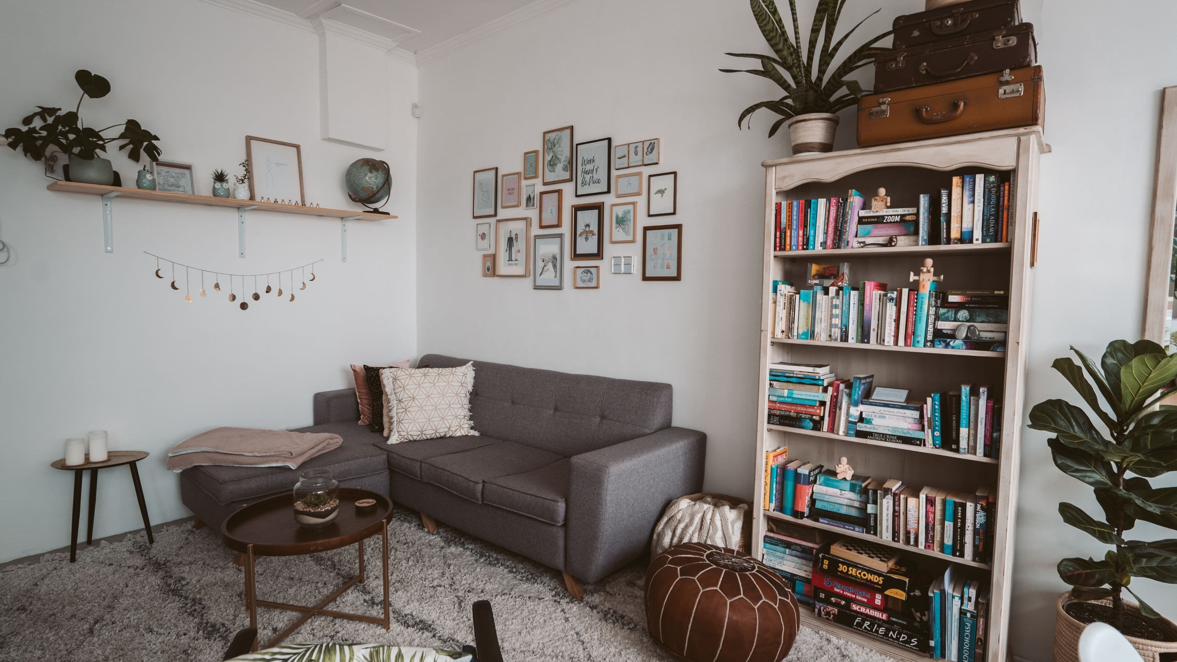
Wood grain is an underused element in mixing discussions. Combining pieces with different grain patterns – one with a tight, fine grain and one with a more pronounced open grain – creates visual interest that's distinct from the tone difference. This layering effect actually makes a room feel more intentional because the variety is happening on multiple axes, not just color.
Straight-grained wood (like maple or beech) reads as more contemporary and clean. Wavy or cathedral grain (common in oak and ash) reads as warmer and more traditional. Open-pored grain (like oak) has a different texture quality than close-pored grain (like maple). Pairing a smooth, close-grained piece with an open-grained piece with visible texture creates a visual contrast that works even when the tones are similar, because the materials feel different from each other. This is particularly useful in rooms where you want warmth and cohesion without extreme tonal contrast.
Step 5: Use Anchor Points to Connect the Tones
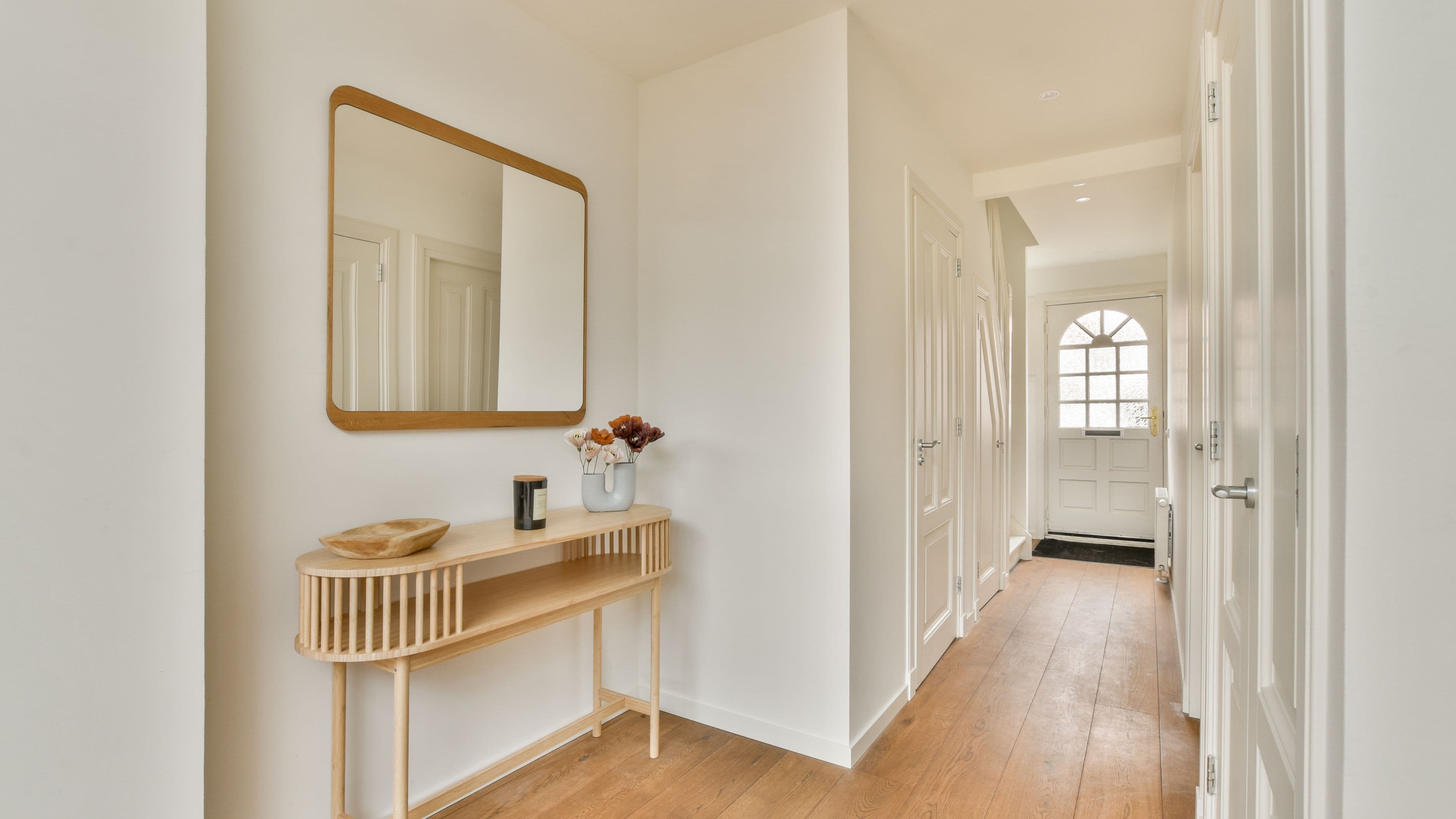
When multiple wood tones are present in a room, the room can start to feel like the pieces are competing rather than belonging together. The fix is to use anchor points – non-wood elements that reference both tones and create a visual bridge between them.
A rug that pulls out the undertones of both your floor and your furniture is one of the most effective anchor tools available. If your floor is a warm honey oak and your furniture is darker walnut, a rug with both warm ochre and deep brown tones visually connects the two. Similarly, textiles – cushions, throw blankets, curtains – that reference both tones in a pattern or layered arrangement tell the eye that the combination is purposeful.
Wall color is another anchor. A warm white or off-white wall reads neutrally against warm wood tones. A cooler greige (grey-beige) wall provides a backdrop that bridges warm and cool wood pairings. Understanding what your wall color does to the wood tones in the room – whether it emphasizes warmth or cools things down – is one of the most effective calibration tools available without changing any furniture.
What to Avoid
Avoiding two pieces that are almost the same tone but not quite. This is the most common mixed-wood mistake. If two pieces are close but not identical, they read as a failed attempt to match rather than a deliberate pairing. Either match them closely or contrast them deliberately – avoid the middle ground.
Avoid equal visual weighting across multiple tones. If the room has three different wood tones in equal proportion, the eye doesn't know where to land and the space feels unsettled. Establish a clear dominant tone and let the others play a supporting role.
Avoid mixing too many species with dramatically different undertones. There's a workable number of wood tones for most rooms – typically two to three. Adding a fourth or fifth distinct tone, especially across different warm-cool positions on the spectrum, starts to push the room into genuinely cluttered territory where no amount of design logic will hold it together.
Avoid ignoring the floor. The floor is the dominant wood surface in most rooms by square footage. If the furniture tones don't have any intentional relationship to the floor tone, the room will feel disconnected regardless of how well the furniture pieces work with each other. Always start with the floor as your reference point.
Avoid relying on matching to create cohesion. The desire to make everything match usually produces rooms that feel sterile or that highlight the inevitable slight differences between "matching" pieces. Cohesion comes from proportion, temperature consistency, and anchoring – not from identical tones.
A Real-World Example
Consider a living room with medium-tone ash grey engineered wood floors (cool, pronounced grain), a walnut-stained media unit (warm-dark, tight grain), and a light maple shelving unit (warm-light, minimal grain). That's three tones across different temperature zones and different grain profiles. The fix isn't to swap pieces – it's to anchor them. A rug with warm beige and charcoal tones pulls the warm walnut and cool ash together. Adding warm-toned brass hardware and amber glass vessels on the shelves references the warmer tones and creates continuity. The media unit and shelving become a secondary and accent relationship rather than two competing focal points.
No single item was changed. The anchoring did the work.
FAQ
How many different wood tones is too many in one room? Two to three tones is the workable range for most rooms. A dominant, a secondary, and one accent tone can create genuine depth and warmth without visual chaos. Going beyond three distinct tones – especially at similar visual weights – makes it very difficult to create cohesion without extensive anchoring through textiles and color.
Can I mix warm and cool wood tones successfully? Yes, but the contrast needs to be clear enough that it reads as intentional. A warm honey oak floor with a cool grey-washed furniture piece works because the difference is obvious. A warm golden oak with a slightly cool beige wood doesn't work because the difference is ambiguous and looks like an attempted match that didn't quite succeed.
Does the finish on wood pieces matter for mixing? Yes, significantly. Matte finishes read differently from high-gloss finishes even on wood of the same species. Mixing a satin-finish piece with a matte piece and a high-gloss piece in the same room creates variation that goes beyond tone and can add to visual clutter. Keeping finishes relatively consistent while varying tone is usually easier to manage than varying both simultaneously.
What if I have existing pieces that don't work well together? Start with what you have and use anchoring techniques before making any purchases. A new rug, different wall color, or changed textile palette can resolve a surprising number of wood tone conflicts without replacing any furniture. If one piece is genuinely incompatible with the rest, it's usually the piece that sits closest to the middle of the warm-cool spectrum with no clear allegiance to either side.
Is it okay to mix painted furniture with wood tones? Yes – painted furniture is actually one of the easiest mixing tools because it removes itself from the wood tone equation. A white or charcoal painted piece doesn't compete with any wood tone and can anchor a room that has too much tonal variation elsewhere. Strategic use of painted pieces can reduce the complexity of a mixed-wood room without removing the warmth that wood brings.
Outro
Mixing wood tones isn't about perfect rules – it's about understanding the logic of why things work and applying it with intention. Establish a dominant tone, use clear contrast rather than ambiguous similarity, distribute tones in proportion rather than equal weight, and anchor the composition with textiles and color that connect the pieces. Done that way, mixed wood tones create the kind of warm, layered, lived-in quality that matched rooms rarely achieve.
📚 Sources
Architectural Digest – How to Mix Wood Tones in Your Home: https://www.architecturaldigest.com/story/how-to-mix-wood-tones
Elle Decor – Interior Design Color Rules That Work: https://www.elledecor.com/design-decorate/color/a14568027/60-30-10-color-rule
House Beautiful – The Right Way to Mix Wood Tones: https://www.housebeautiful.com/room-decorating/a29877131/mixing-wood-tones