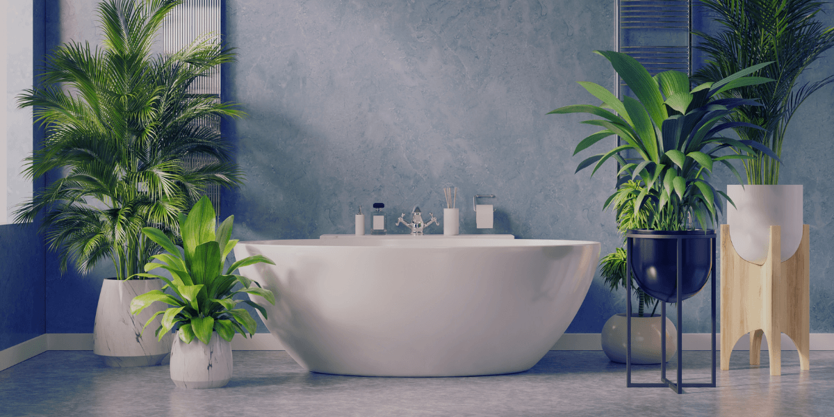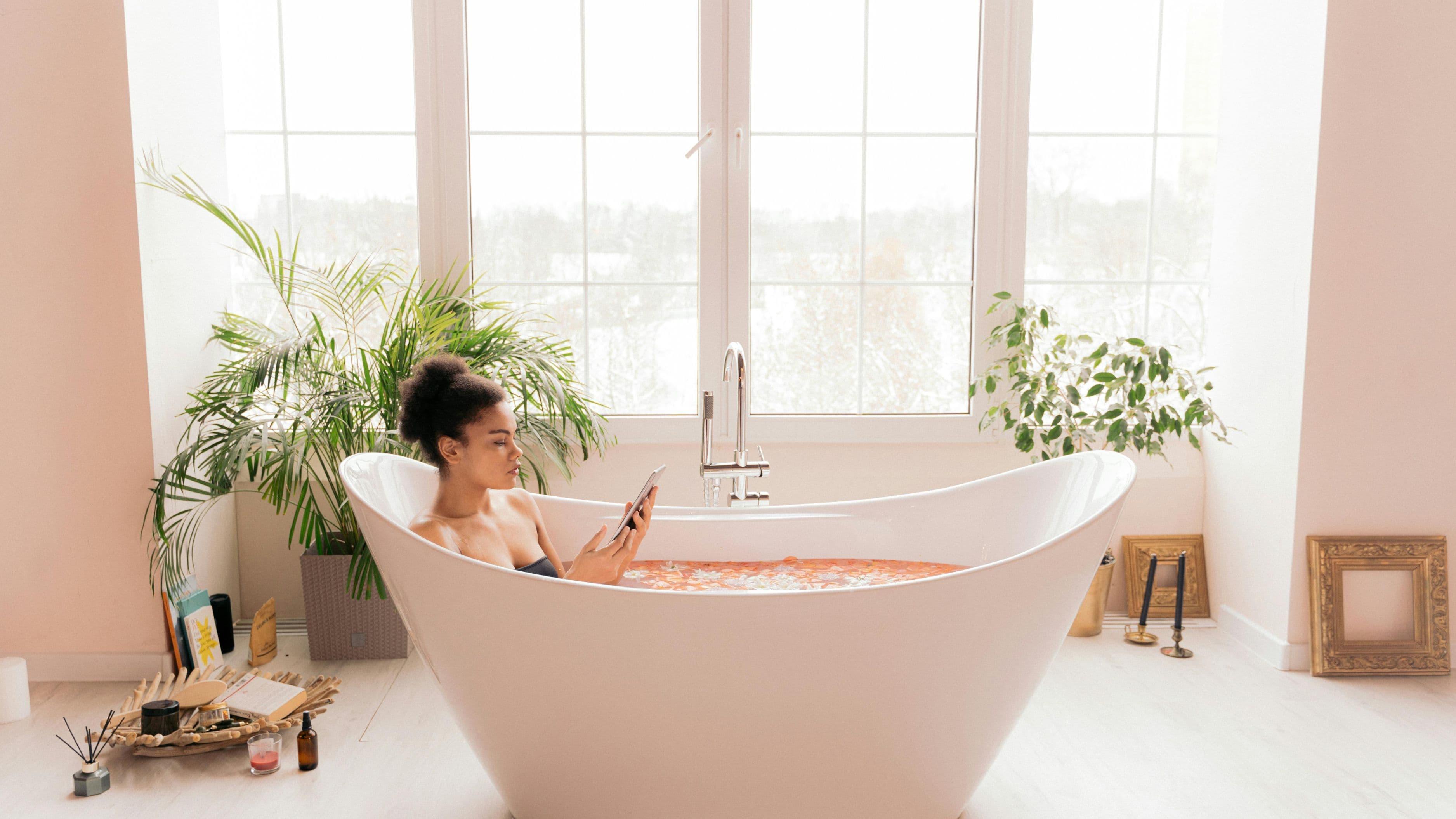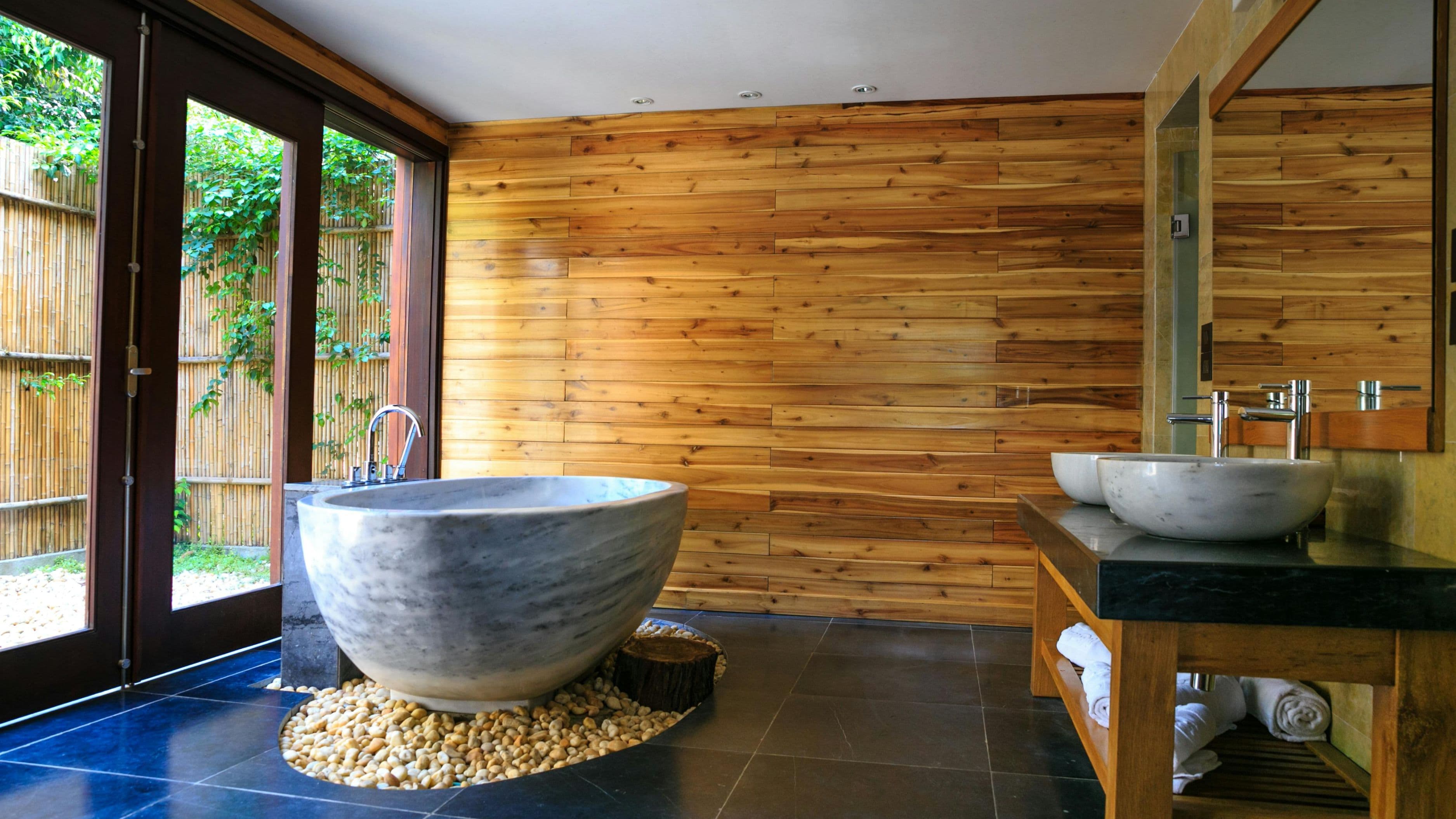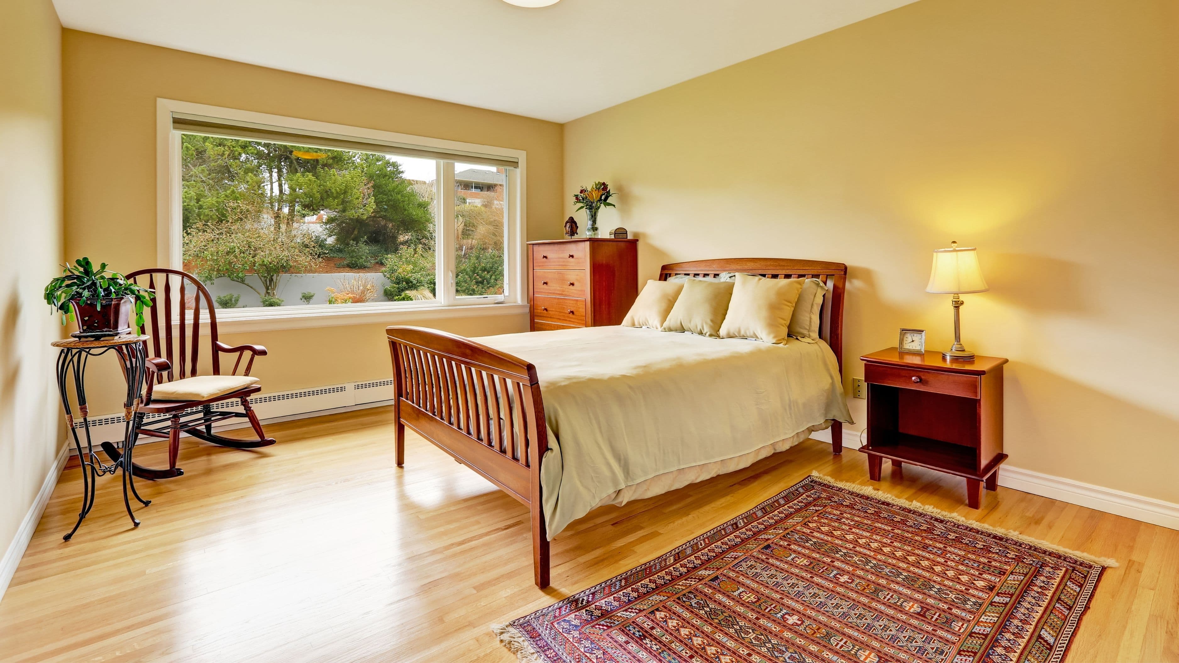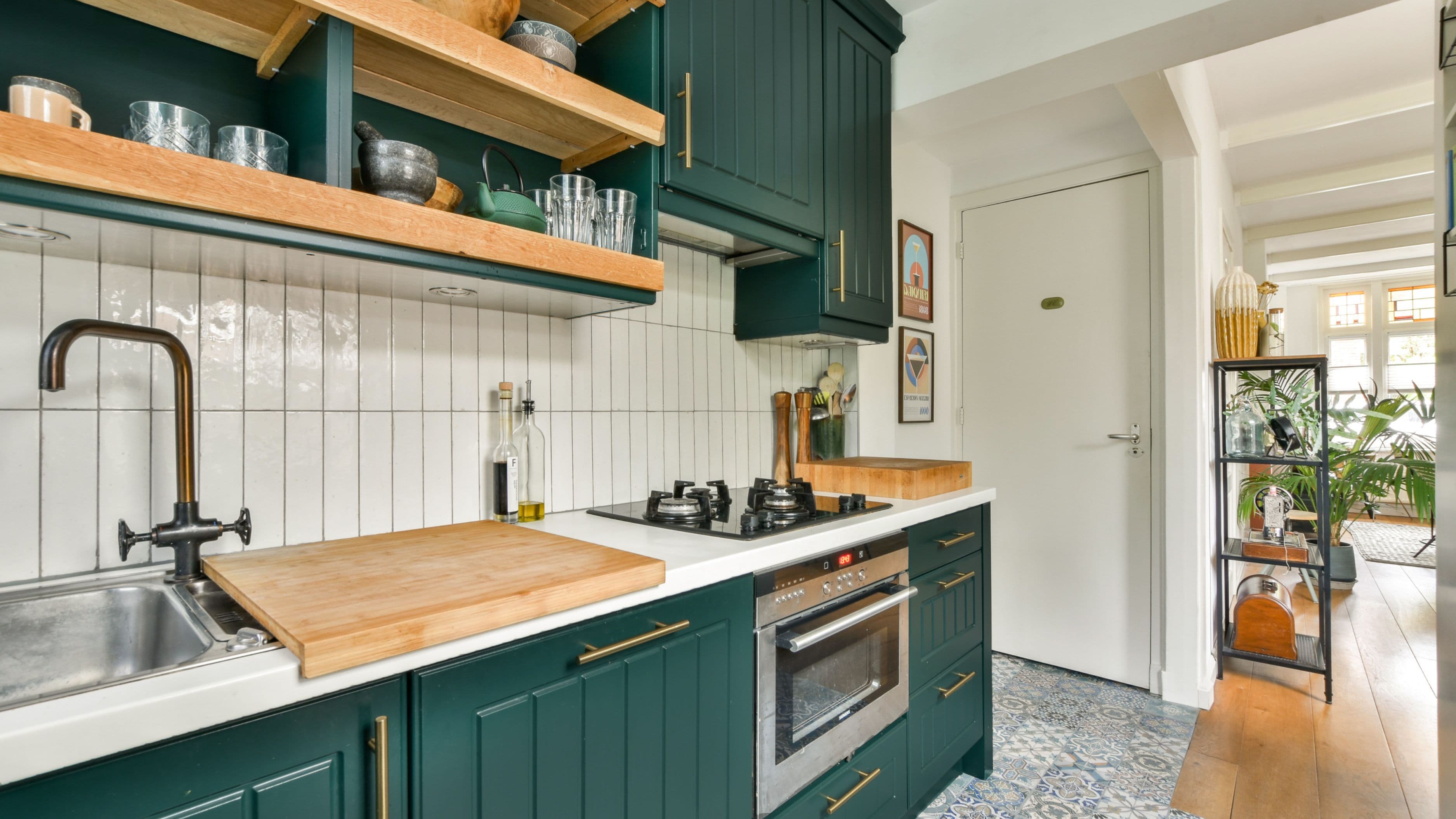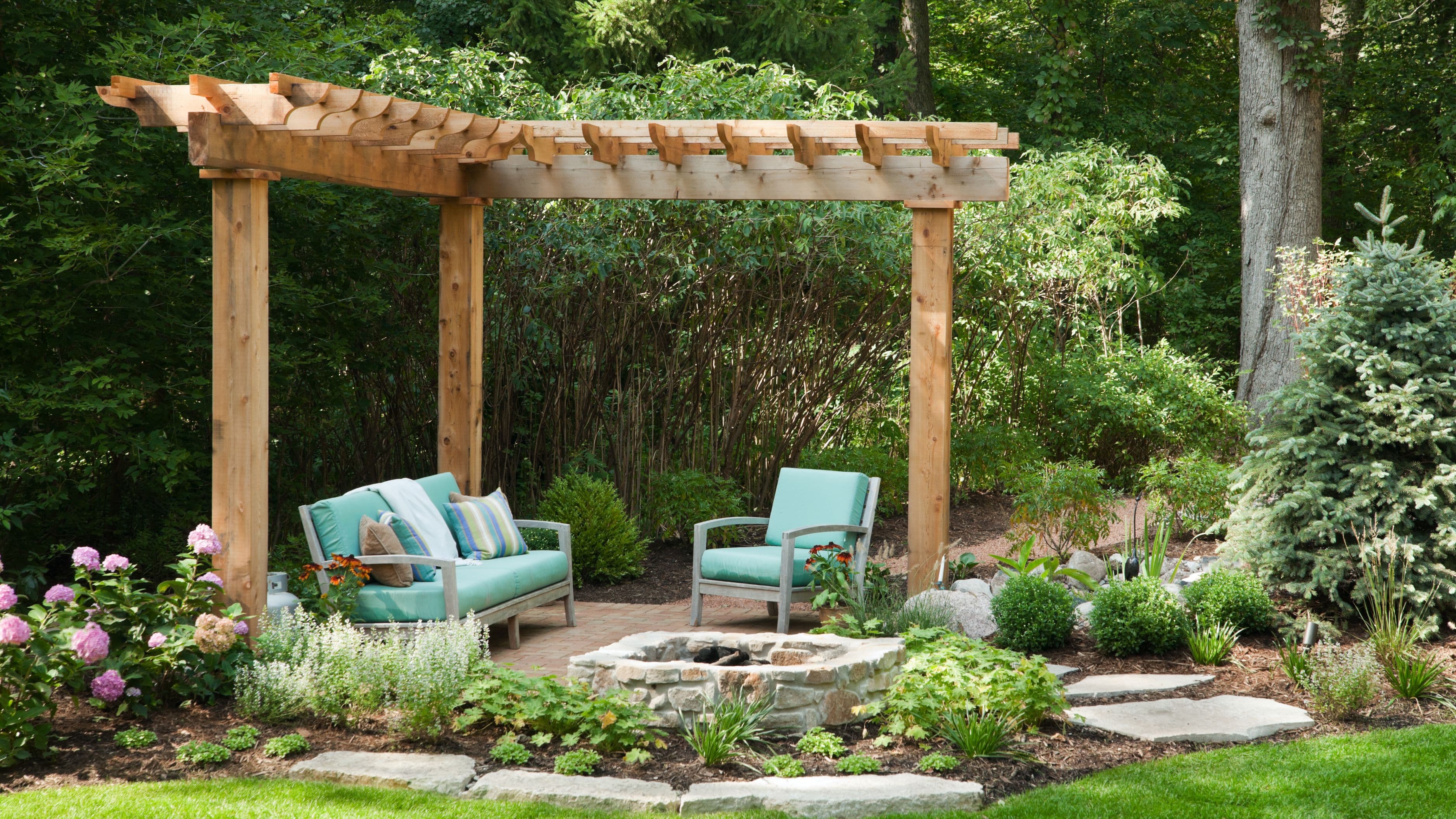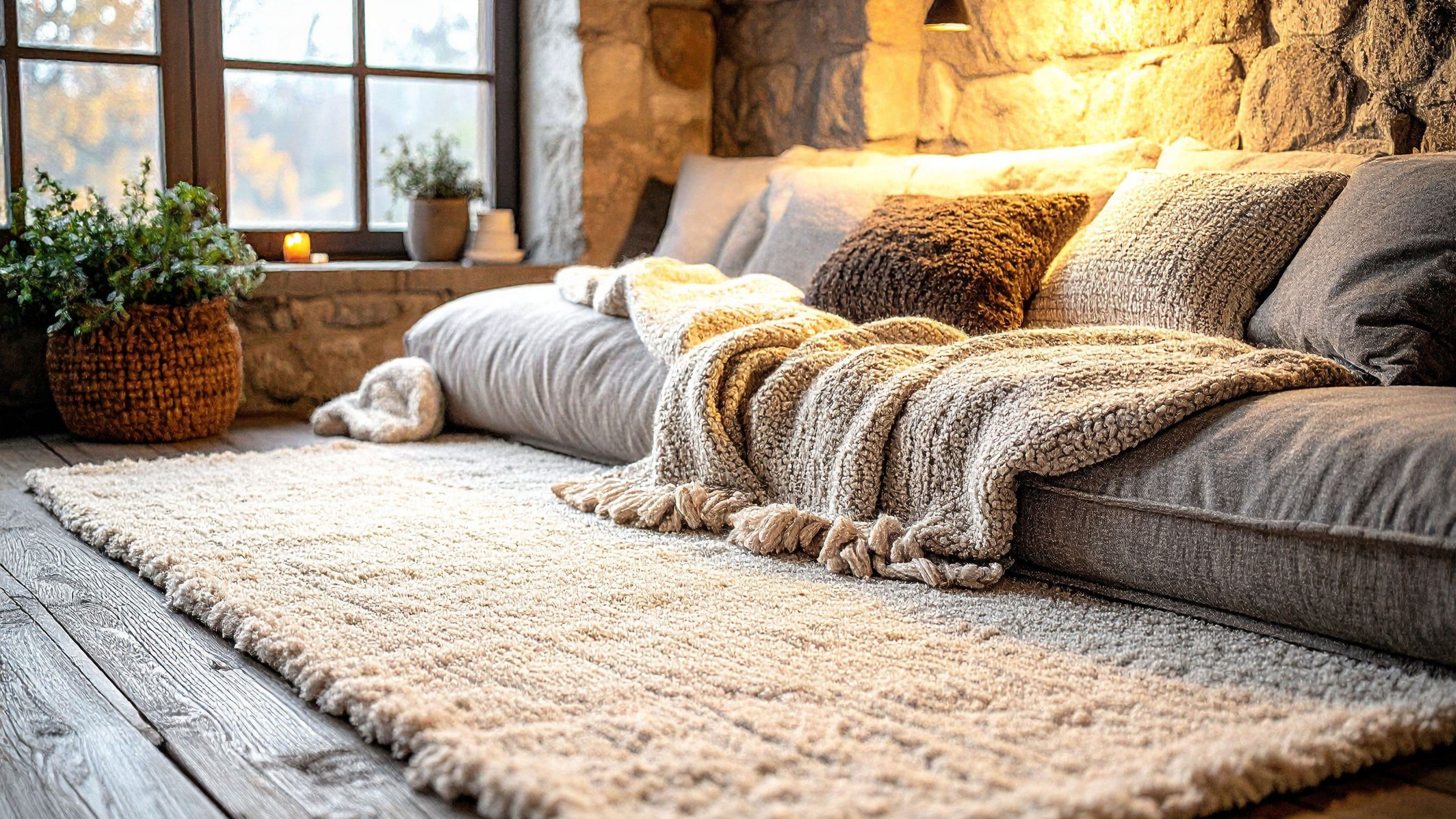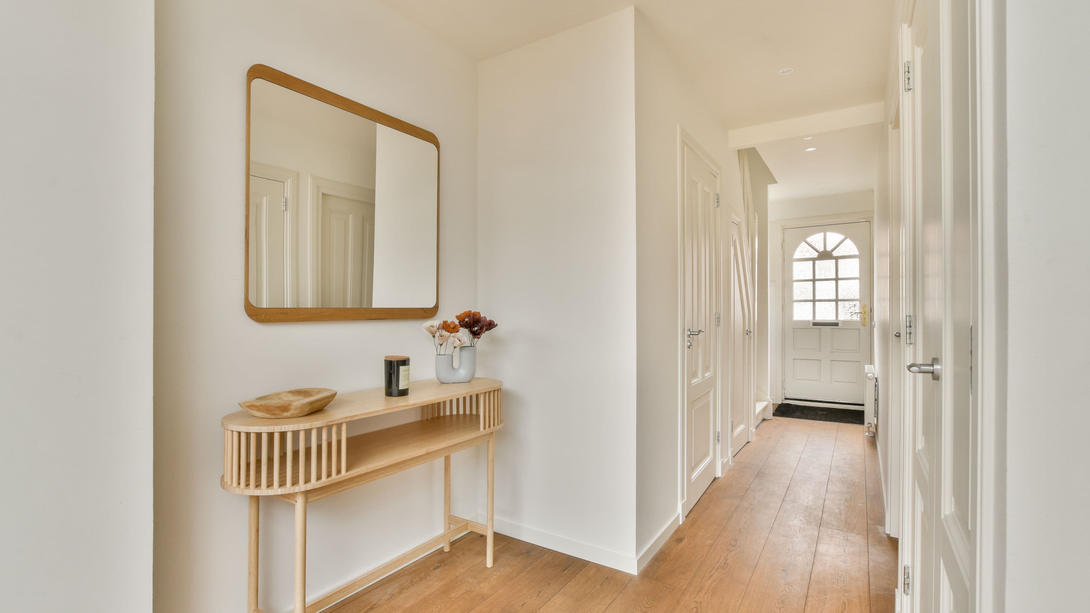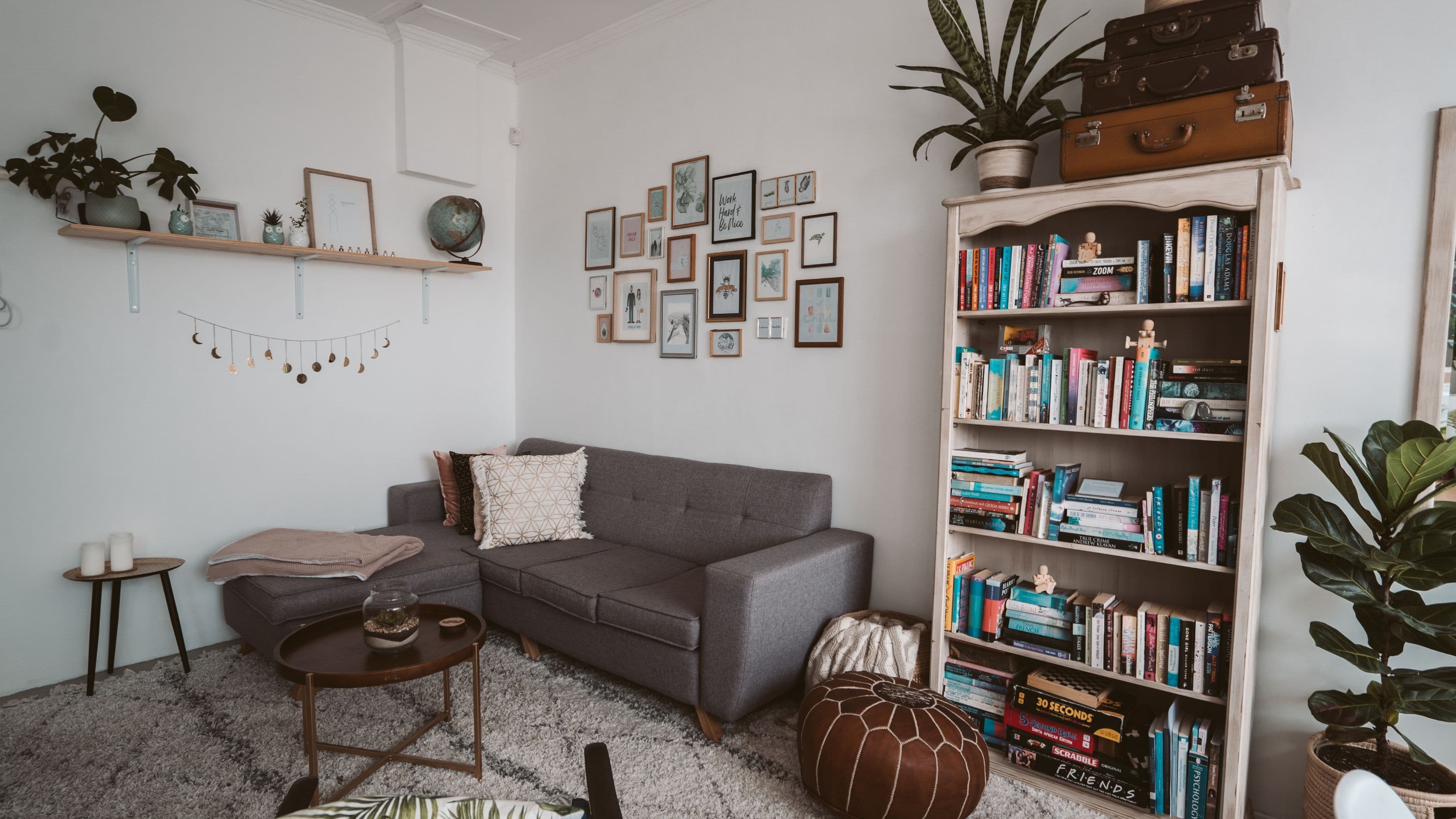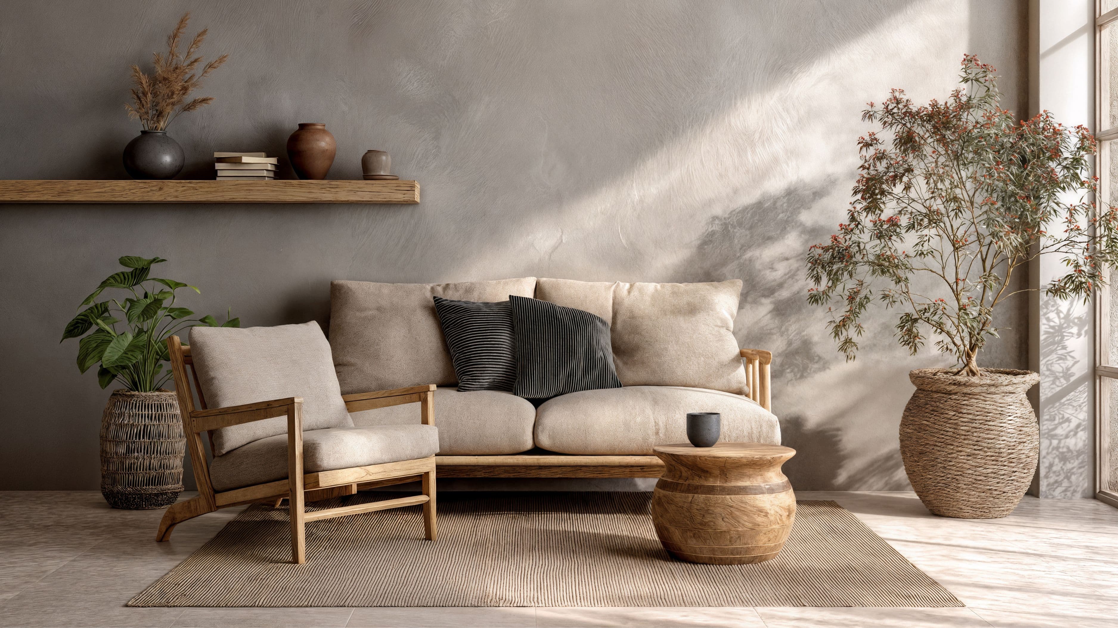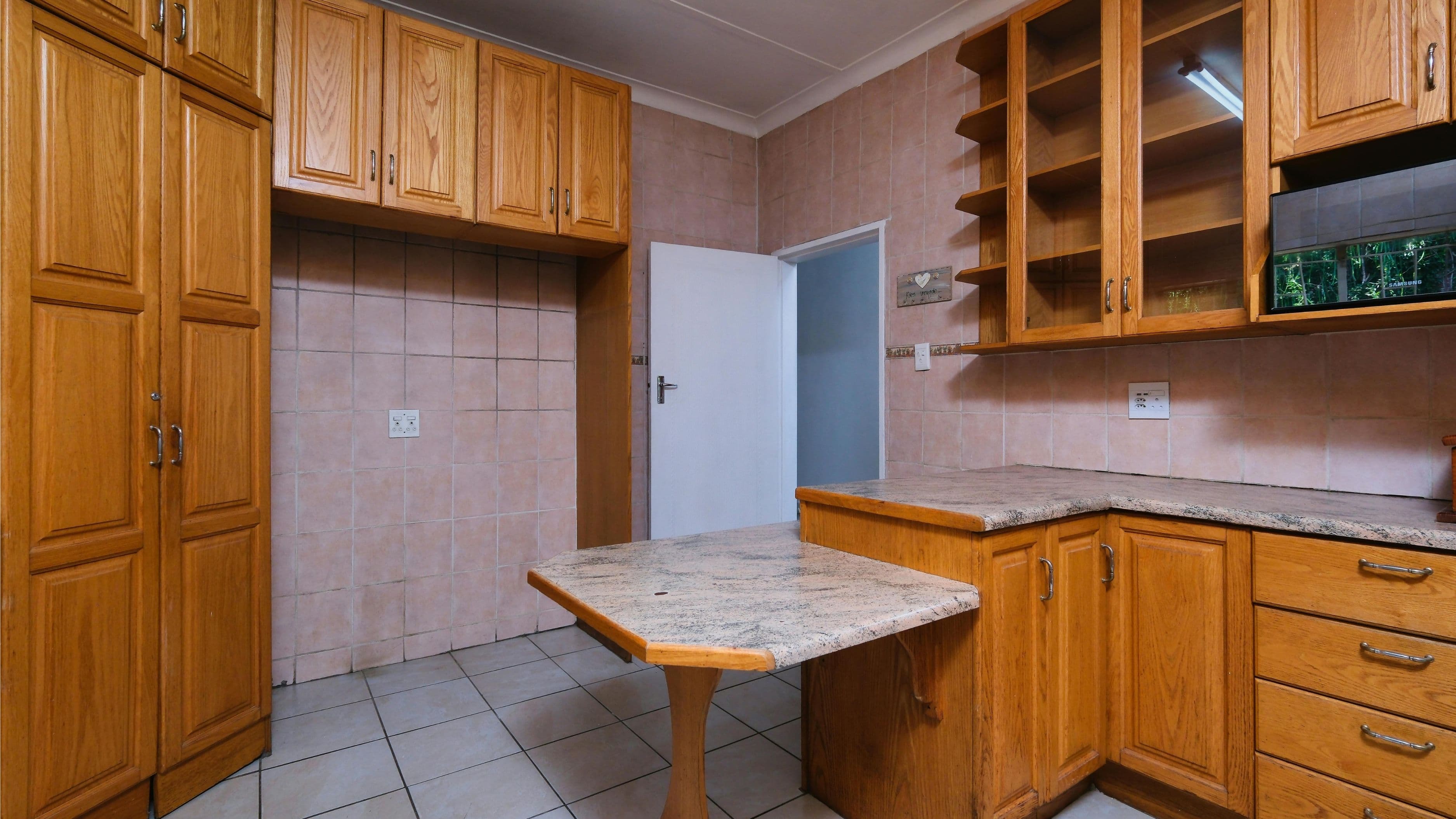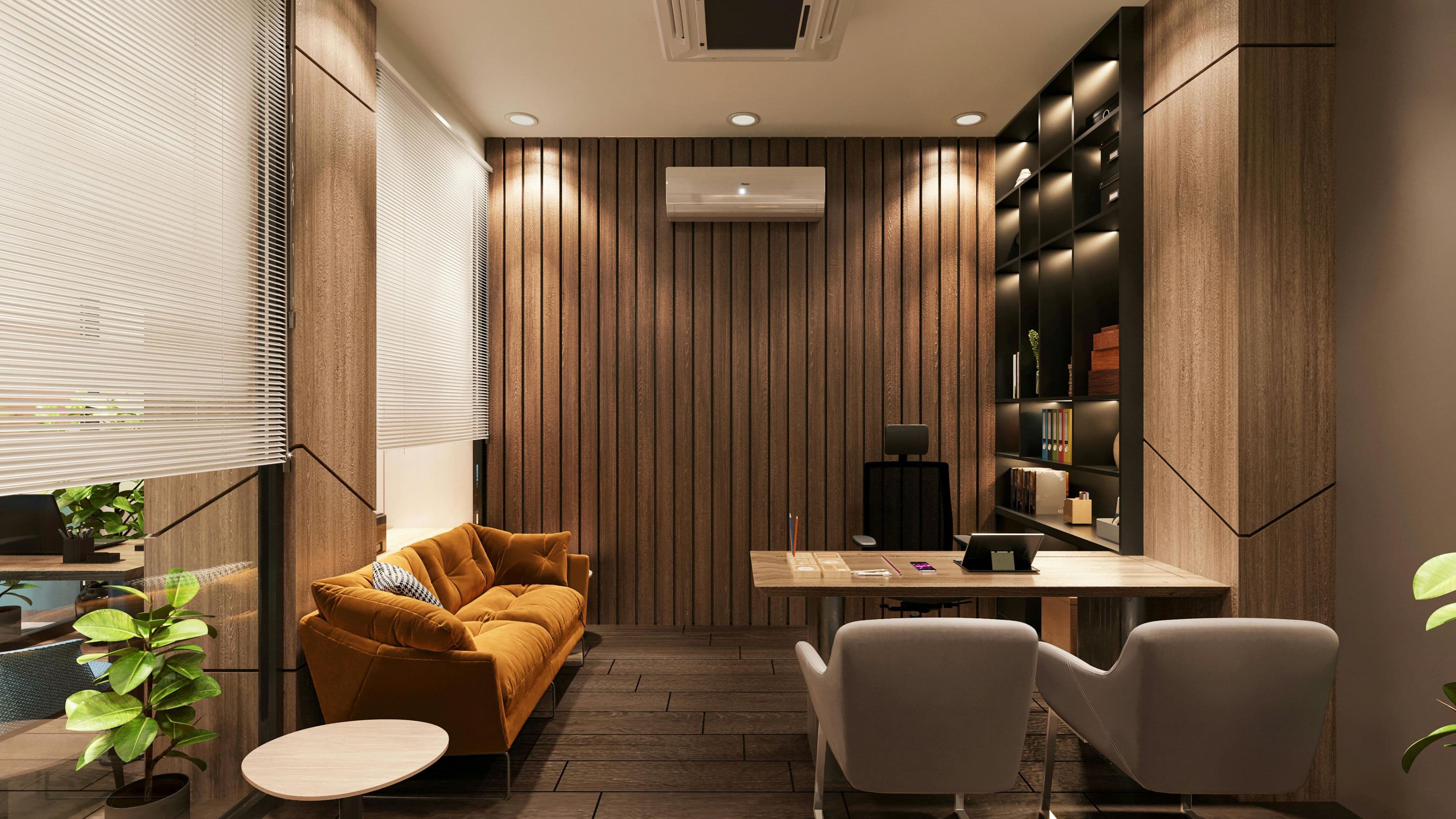

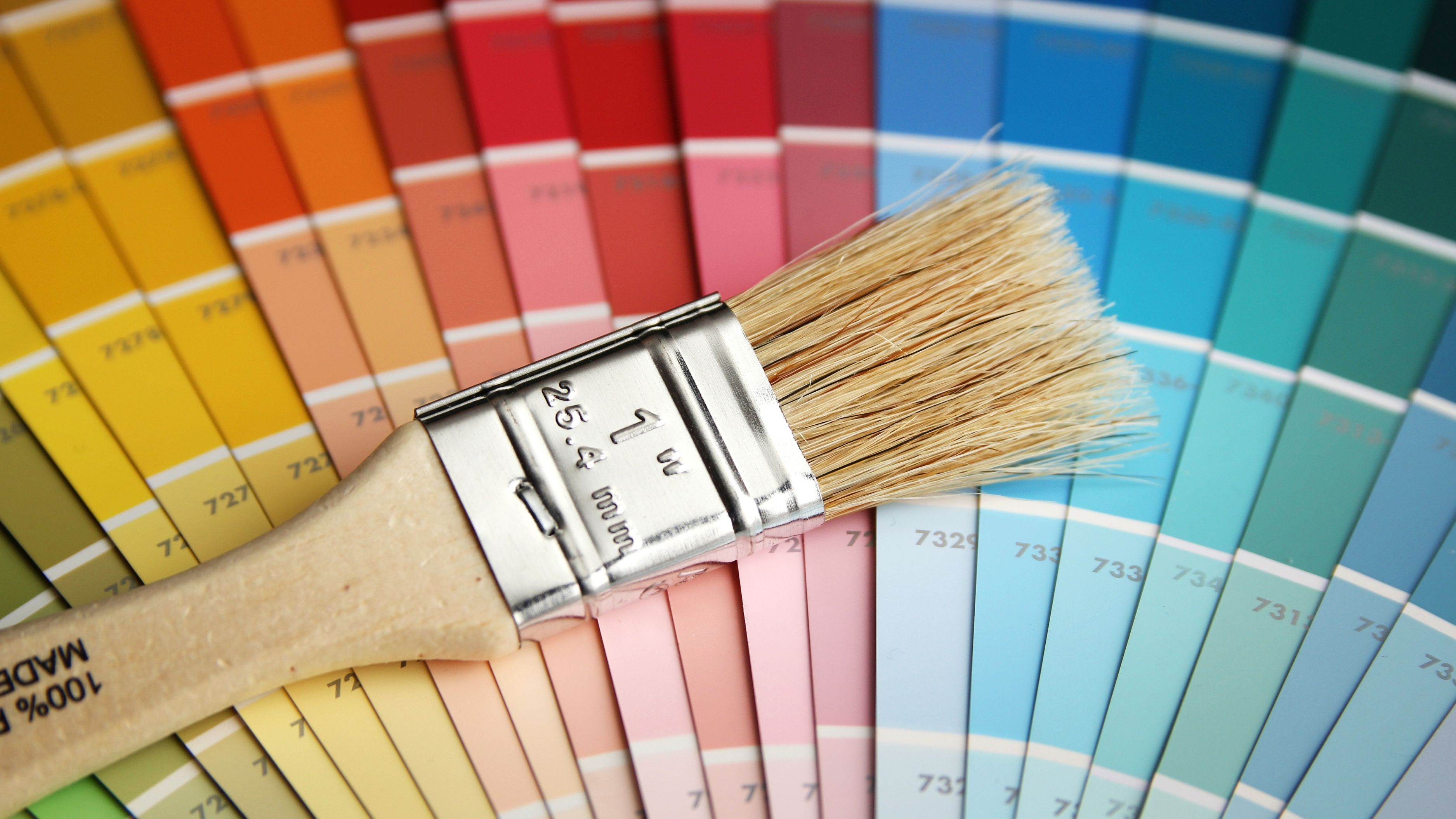
Getting a whole-home color palette right is less about finding the perfect color and more about building a system — one that creates flow, handles different lighting conditions across rooms, and still gives individual spaces their own character. Here's how to do it practically.
Step 1: Start With Your Fixed Elements, Not a Paint Chip
Before you look at a single color swatch, take stock of what you can't change — or aren't planning to change anytime soon. Flooring, countertops, cabinetry, tile, brick, and major furniture pieces are the fixed anchors of your palette. Your paint colors need to work with these elements, not the other way around.
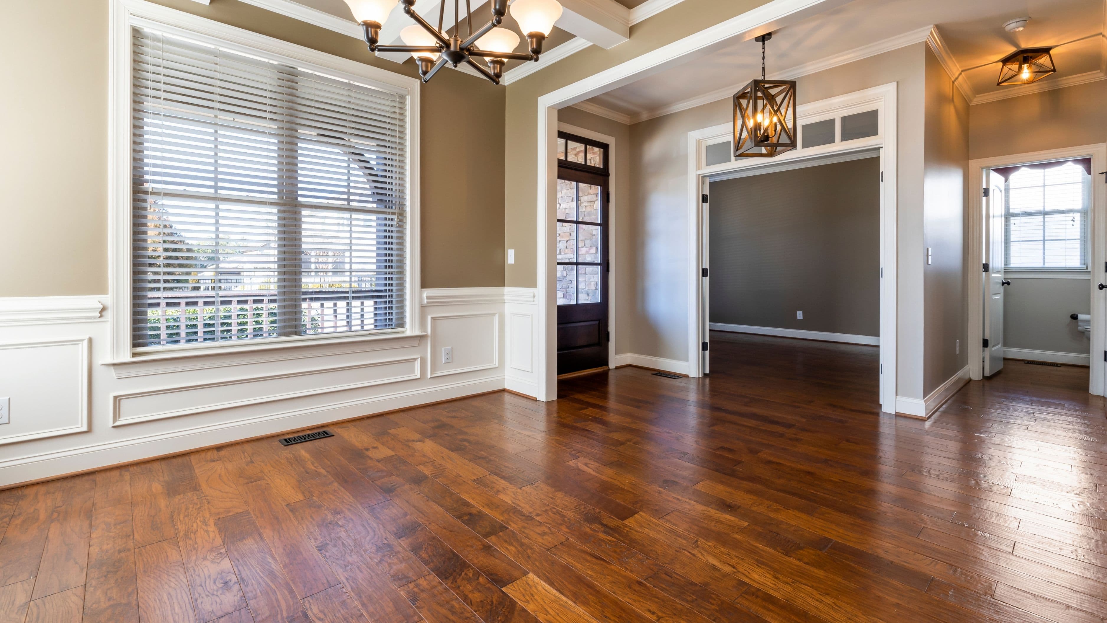
Walk through each room and note the undertones in your fixed elements. Wood floors often have warm orange or yellow undertones. Some "gray" tile is actually quite blue or green. White marble countertops can have warm beige or cool gray veining. These undertones will either clash or harmonize with your paint choices, and you won't be able to see the conflict until it's on the walls — unless you identify it first.
The single most useful exercise here is pulling a 2-inch square sample of your flooring or countertop and holding it next to potential paint chips in the same light as the room. If the undertones clash — warm flooring next to a cool paint — the room will feel subtly wrong even if both colors are attractive individually. Your palette needs to share undertone language across the whole house.
Step 2: Build Around a Palette Architecture, Not Individual Colors
A cohesive whole-home palette typically has three tiers: a dominant neutral that runs through most of the home's primary spaces, a secondary color or two for accent rooms and architectural details, and a consistent trim and ceiling approach that ties everything together.
The dominant neutral does most of the heavy lifting. This is the color that appears in your open-plan areas, hallways, and any space that connects to other rooms visually. It doesn't have to be beige or white — it just needs to be versatile enough to sit comfortably next to the colors in adjacent spaces. Many designers refer to this as the "backbone" color, and choosing it well makes every other decision easier.
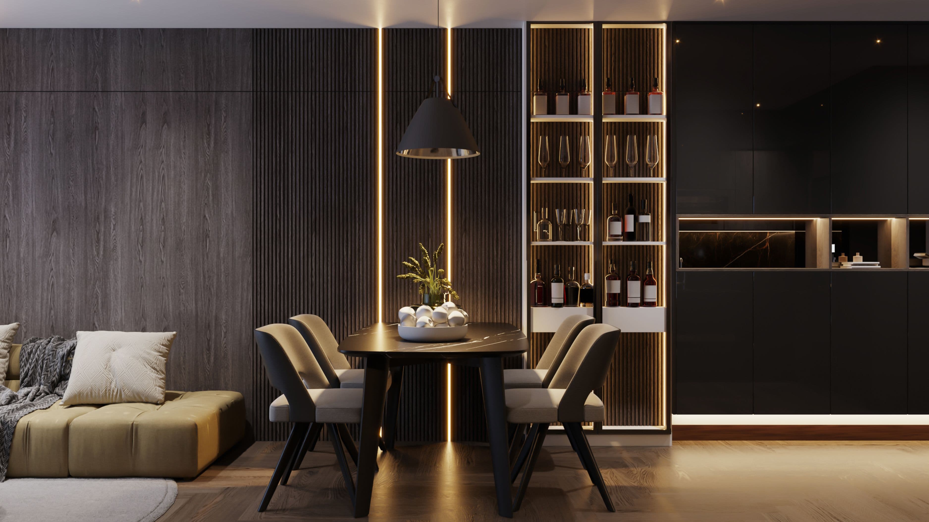
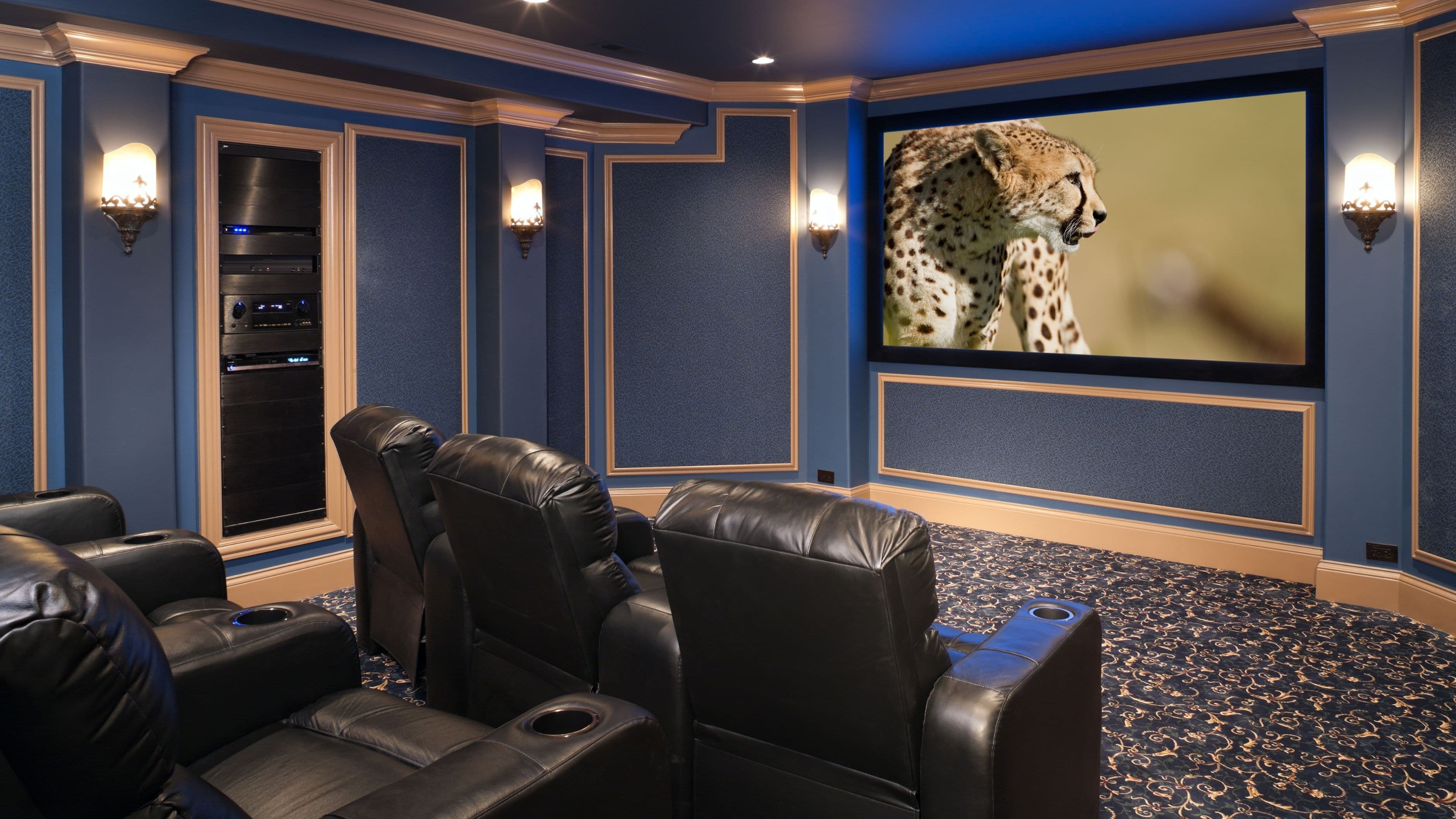
Secondary colors give individual rooms personality without disconnecting them from the whole. A bedroom can be a deeper, moodier version of the palette — a saturated navy or forest green — as long as it shares the undertone family of the dominant neutral and the trim color provides continuity. The transition from room to room should feel intentional, like a natural progression, not a sudden shift in atmosphere.
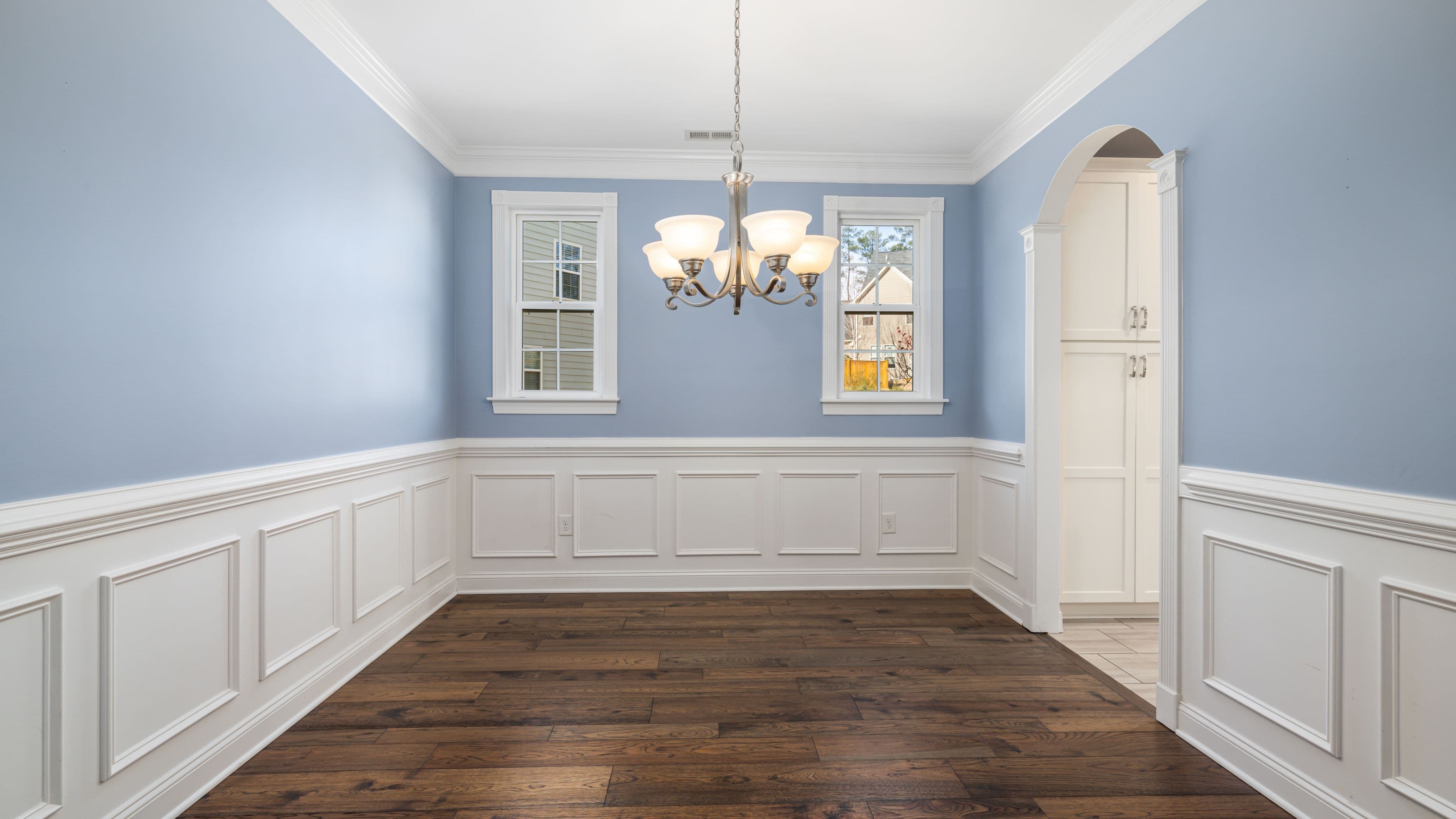
Trim color is often underestimated as a unifying tool. Running the same trim color — whether bright white, soft white, or a warm off-white — throughout the entire home creates visual consistency that allows the wall colors to vary more freely. If you change trim colors room to room, the whole-home coherence unravels even if the wall colors are related.
Step 3: Understand How Light Changes Everything
The color you choose in the paint store will look different in every room of your home. Natural light direction, artificial light temperature, room size, and ceiling height all affect how a color reads in practice. This is one of the most common sources of paint regret, and it's entirely avoidable if you test before you commit.
North-facing rooms receive cool, indirect light throughout the day, which tends to pull out blue and green undertones and make warm colors appear flat. South-facing rooms get abundant warm light that makes almost any color look better — but can make warm colors feel overwhelming in summer. East-facing rooms are bright and warm in the morning and fall into shadow by afternoon. West-facing rooms are dark in the morning and bathed in warm, golden light in the evening.
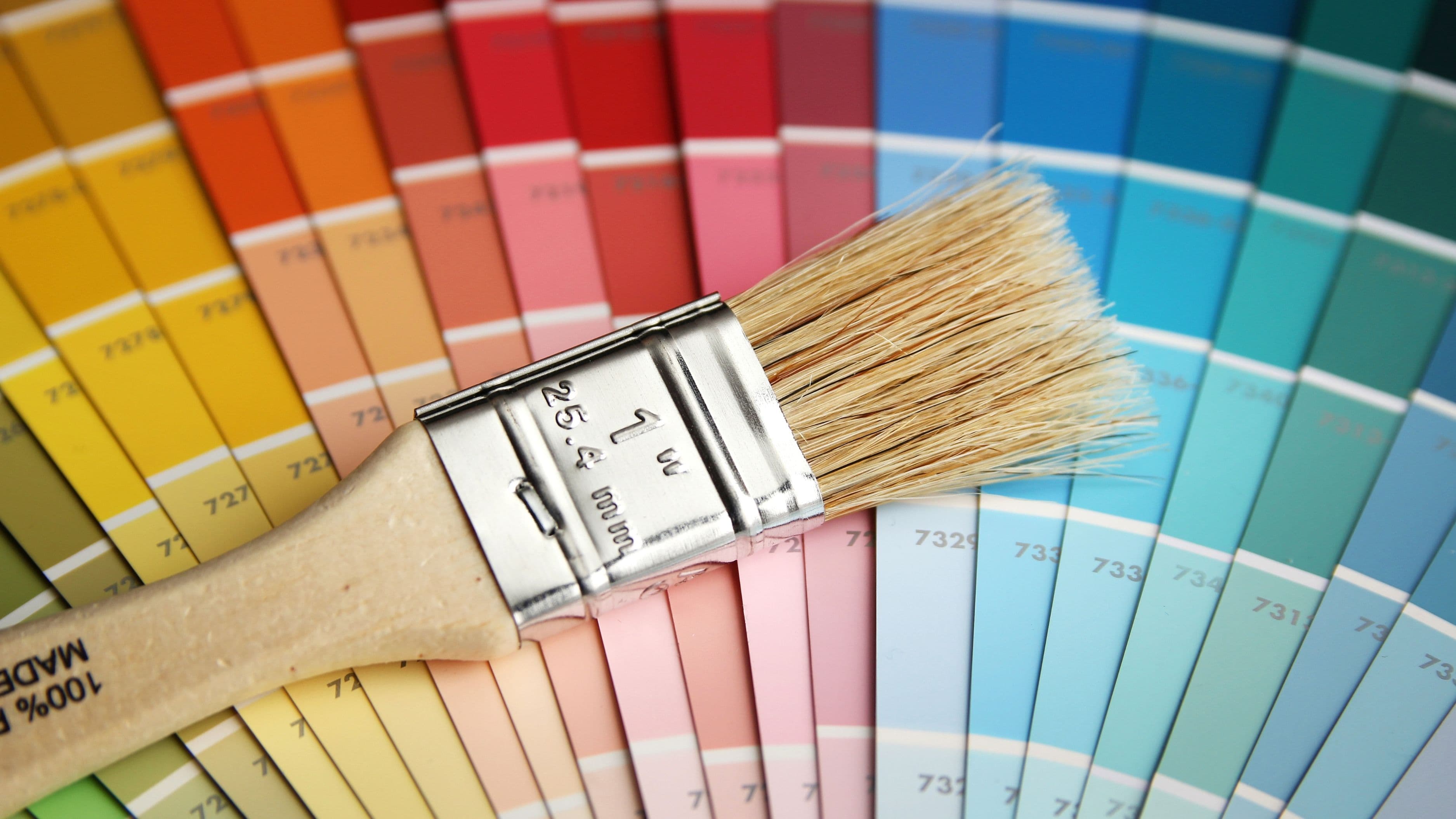
The only reliable way to evaluate a color for a specific room is to paint a large sample patch — at minimum 12 inches by 12 inches — directly on the wall and observe it at different times of day and under artificial lighting at night. Color fan decks and small swatches simply can't replicate how a color behaves at scale under real conditions. This step is worth the extra paint cost and time; it will save you from a full repaint.
Step 4: Use the 60-30-10 Rule as a Starting Framework
The 60-30-10 rule is a proportion guideline that has been used in interior design for decades because it works. The idea is that any room's color should be broken into roughly 60% dominant color (usually the walls), 30% secondary color (large furniture, rugs, cabinetry), and 10% accent color (pillows, art, accessories, hardware).
At the whole-home level, you can apply the same logic across the house: the dominant neutral takes up roughly 60% of the visible surface area across all rooms, the secondary palette occupies about 30% of distinctive spaces (accent walls, colored rooms, bold cabinetry), and accent colors appear as the 10% that adds personality without overwhelming.
This isn't a rigid rule — it's a proportion check. If you step back from a room and the accent colors seem to dominate, you've likely inverted the ratio. If the whole house feels monochromatic and flat, you've probably under-invested in the secondary and accent tiers. The framework gives you a way to diagnose proportion problems before repainting.
Step 5: Test Transitions at the Threshold
One of the most overlooked steps in whole-home color planning is testing how two adjacent colors look together at the threshold — the doorway or opening where one room meets another. A color that looks fine in isolation can create a jarring visual jump when placed next to its neighbor.
The practical test: paint your samples large enough that you can hold or tape them side by side and view them from the hallway or adjacent room. If the transition feels abrupt, try one of three adjustments. Use a deeper or lighter value of the same color family to ease the shift. Place the transition at an architectural break — a door frame, a wall offset, a change in ceiling height — rather than across an open threshold. Or introduce a bridge color in the connecting hallway that shares undertones with both rooms.
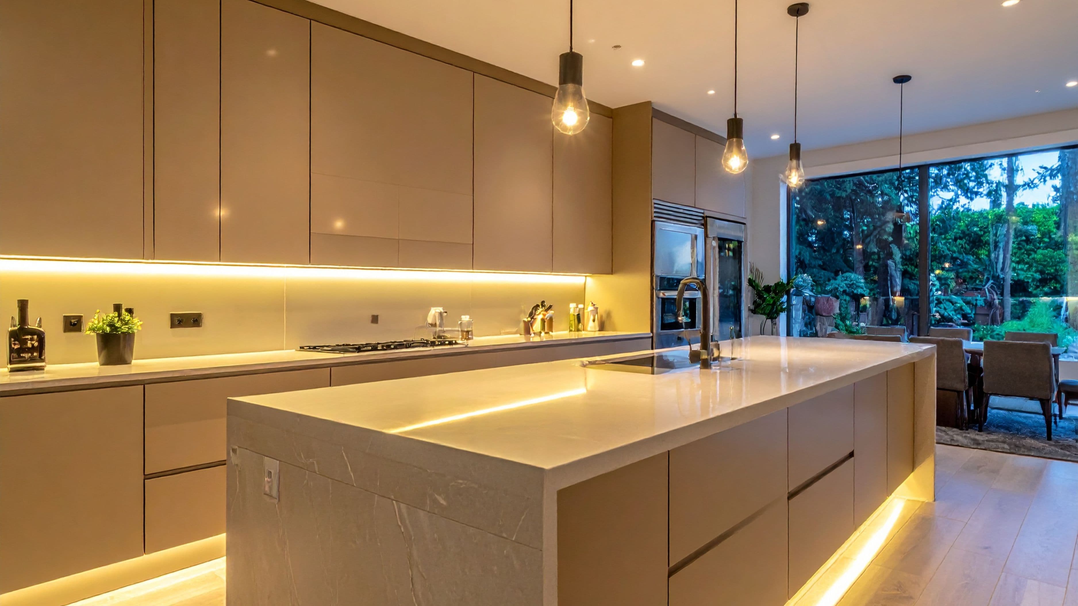
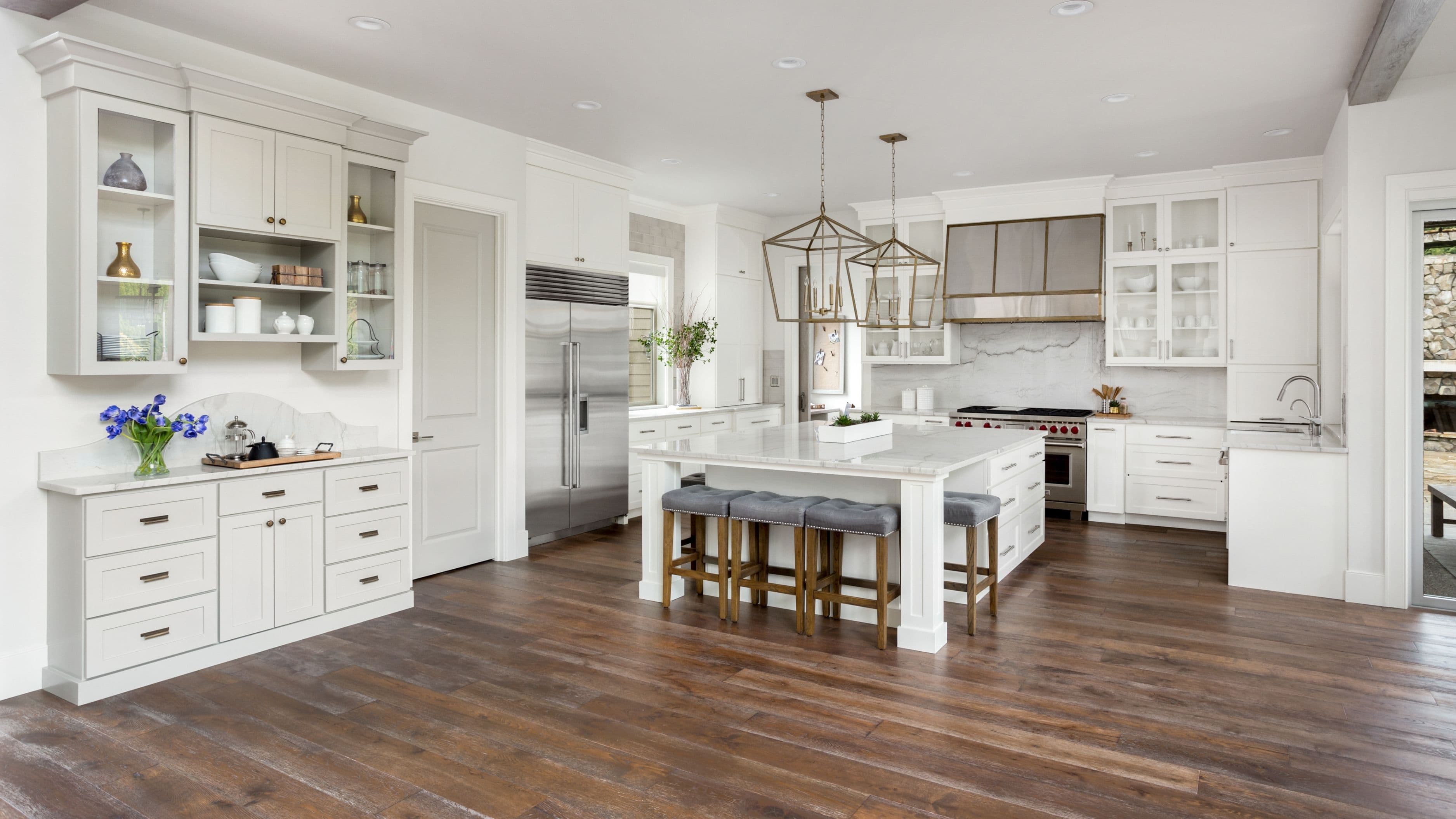
Open-plan homes require particular care here because multiple spaces are visible simultaneously. In a kitchen-dining-living space that flows together without walls, the wall color effectively needs to be a single decision rather than three separate ones — any variation will be immediately visible and should be deliberate, such as a painted kitchen island in a contrasting hue against neutral walls.
Common Mistakes to Avoid
Choosing colors from a screen or small swatch. Digital color representation is unreliable due to screen calibration differences, and small swatches can't replicate how a color behaves at room scale. Always test full-size samples on the actual wall before buying gallons.
Ignoring undertones. The most common source of color clashes is mixing warm and cool undertones without realizing it. A warm-white trim with a cool-gray wall creates a subtle tension that makes the room feel unresolved. Always identify the undertone of every element and choose paint accordingly.
Going too dark in small spaces before testing. Deep, saturated colors can work beautifully in small spaces — but they need abundant natural light or strong artificial lighting to avoid feeling oppressive. Test a dark color in a small room at night, with your actual lighting, before committing.
Matching paint to fabric or art. Trying to perfectly match a paint color to a patterned sofa or a piece of artwork usually produces a confining result. Instead, pull one secondary color from the pattern and use that as an inspiration point — not a match target.
Changing trim colors between rooms. Unless you have a strong architectural reason to differentiate (a bold accent room where the trim is intentionally part of the statement), consistent trim color throughout the home is one of the simplest and most effective cohesion tools available.
Skipping the ceiling. Ceiling color is part of the palette whether you think about it or not. Standard white ceilings in a room with warm walls create a jarring top. Many designers tint the ceiling paint slightly — adding a small amount of the wall color to white — to soften the transition without making the ceiling feel heavy.
Cost and Effort Expectations
Planning a whole-home palette is primarily a time investment rather than a large cost. Paint itself is one of the most affordable renovation materials — a gallon of quality interior paint runs $35–$70, and most rooms require 1–2 gallons per coat depending on size. A whole-home repaint of a 2,000 square foot house using the same color scheme throughout typically costs $1,500–$4,000 in labor if professionally done, or considerably less if you DIY.
The cost of doing it wrong — buying gallons of the wrong color, repainting a room twice, or living with a palette that bothers you every day — is both financial and psychological. Spending $20–$40 on sample pots and large test patches before buying full gallons is the most efficient money in any paint project.
FAQ
How many colors should a whole-home palette have? Most successful whole-home palettes use 3–5 distinct colors: one dominant neutral, one or two secondary colors for distinctive rooms or architectural features, a consistent trim color, and occasionally an accent. Beyond five colors, visual coherence becomes significantly harder to maintain unless the home is very large with clearly separated zones.
Should open-plan spaces all be the same color? Generally yes, if they flow together without architectural separation. Spaces that are connected visually — where you can see from one area into another — read most coherently when they share the same wall color or very close values of the same color. Differentiation within open plans usually works better through furniture, rugs, and lighting than through distinct wall colors.
Is there a formula for choosing a whole-home neutral? The most reliable approach is to identify the undertone of your dominant flooring, pull paint chips from that undertone family, and eliminate any that feel out of step with your other fixed elements. Greige (gray-beige) tends to be the most forgiving neutral across different lighting conditions and undertone combinations, while pure gray or pure beige can be more sensitive to surrounding elements.
How do I handle a dark hallway with no natural light? Dark hallways are often better embraced than fought. Painting a lightless hallway in a pale color tends to highlight the darkness rather than compensate for it. A deeper, richer color — a warm chocolate, a saturated navy — can make the space feel intentional rather than dim. Good artificial lighting with a warm color temperature (2700K–3000K) matters more than paint color in windowless spaces.
Does wall color affect how large or small a room feels? Yes, meaningfully. Lighter, cooler colors tend to visually recede and make a space feel larger. Darker, warmer colors tend to advance and make a space feel more intimate and contained. Painting all four walls the same color — whether light or dark — tends to feel more cohesive than four different shades. Painting one accent wall a deeper color doesn't consistently make a room feel larger; it usually just emphasizes that wall.
The Payoff of Getting This Right
A well-planned whole-home palette doesn't just look better — it makes the house easier to live in. Furniture is easier to move between rooms. New purchases fit without clashing. The home feels intentional rather than accumulated. And you stop noticing the walls, which is actually the goal — because the colors are working in the background, not demanding attention.
The planning steps aren't complicated, but they do take time and deliberate observation before a single can of paint is opened. That investment pays off every time you walk through a home that actually feels like a whole.
📚 Sources
Architectural Digest – How to choose a whole-home color palette: https://www.architecturaldigest.com/story/how-to-choose-a-color-palette-for-your-home
Benjamin Moore – Understanding undertones in paint color selection: https://www.benjaminmoore.com/en-us/paint-and-colour/articles/colour-basics/undertones 3* Sherwin-Williams – How light affects paint color: https://www.sherwin-williams.com/homeowners/color/find-and-explore-colors/paint-colors-by-family/how-light-affects-color
This Old House – Interior painting guide and color selection tips: https://www.thisoldhouse.com/painting/21014968/how-to-paint-a-room
Fine Homebuilding – Color continuity in open-plan homes: https://www.finehomebuilding.com/2018/05/22/choosing-paint-colors-whole-house